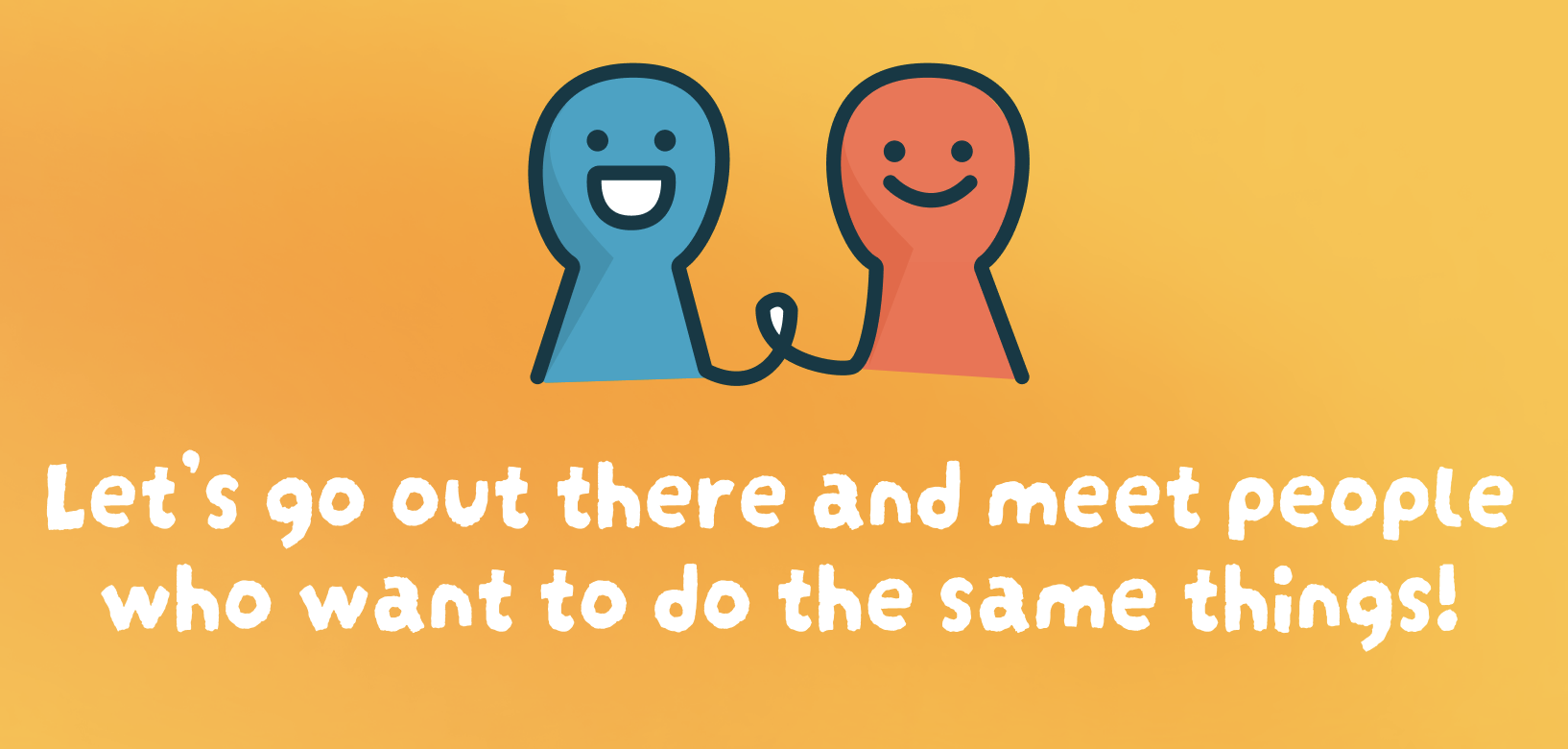
What if making friends online felt more like something you actually wanted to do?
Making friends as an adult is harder than it should be. We designed a better way.
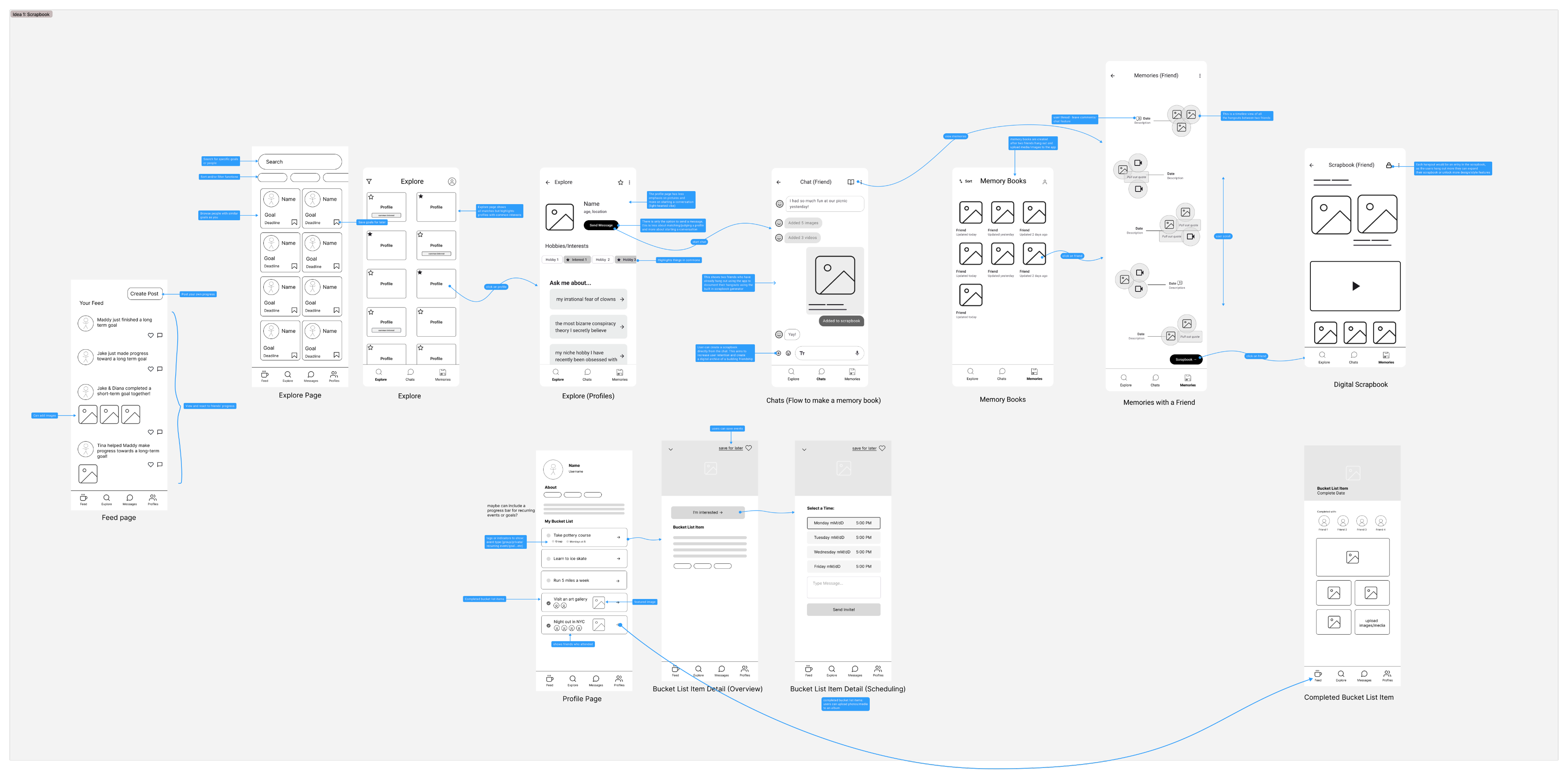
Most friendship apps are just dating apps wearing a different hat, they emphasize creating a profile, swiping on people, and prioritize first impressions rather than second hangouts.
Buckets flips the model. Instead of browsing people, you browse activities. Things you've been meaning to try and waiting to find the right person to do it with. The shared activity becomes the icebreaker and the friendship follows.
There is no convenient way to create lasting friendships as an adult.
We talked to young adults (18–35) in NYC who had recently moved, changed jobs, or gone through a life transition. The same two things came up in almost every conversation.
1. Apps feel like dating apps.
Profile first interfaces put the emphasis on appearance and self-promotion. Users feel judged before they've said a word.
2. One-off meetups don't stick.
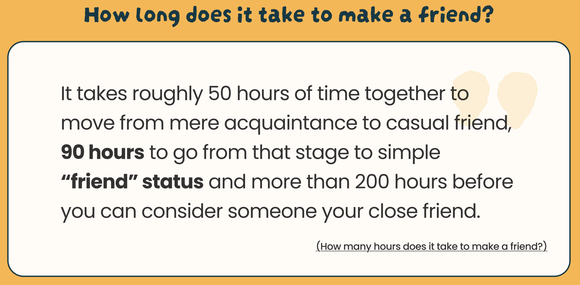
Research on friendship formation shows that you need repeated exposure over time. Most apps optimize for a single hangout and then leave users to figure out the rest.
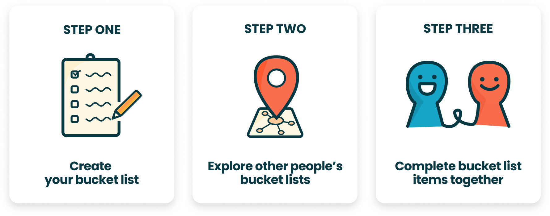
Buckets: activity driven friendship. Browse what you want to do, find people to do it with.
The core flow is simple, you post something from your bucket list, or browse others' listings, and join the ones that interest you. A group chat opens automatically and after the activity, the app prompts you to plan the next one with the same people.
1. Create an activity, find people to try it with

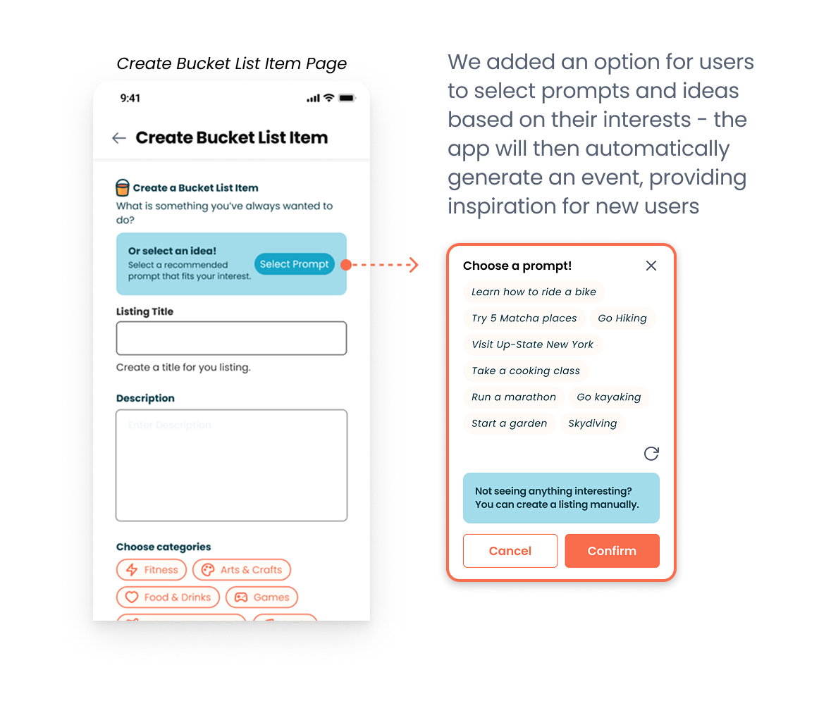
Create a bucket list item
Post an activity you've been meaning to try like a new hiking trail, a pottery class, or a new restaurant. Set a date range, group size, and when you want to meet.
2. Discover activities near you
Discover & Join
Browse activities near you. Filter by category, distance, or type. Each listing shows who's already going so you can get a sense of the group before requesting to join.
3. Plan together, come back again
Chat & Plan
Once joined, a group chat opens automatically. After the activity, the app prompts you to schedule another meet up with the same people. Friendships form through repeated exposure. We built that into the product through follow-up notifications instead of leaving it to chance.
11 interviews. Four patterns came up every time.
We focused on people in transitional moments, fresh out of grad school, recently out of a long relationship, or new to a city. These are the moments when existing friend groups scatter and people have to rebuild from scratch.
Repetition is essential.
Strong friendships require seeing the same people multiple times. One-off meetups almost never convert.
Small groups reduce pressure.
2–4 people felt right. One-on-one felt like a date and large groups felt like a networking event.
Activities create comfort.
Having something to do together makes first meetings less awkward. You already have a topic that isn't "so what do you do?"
As a young adult who values meaningful connections, I want an easy way to build strong, long-lasting friendships so that I can have an emotional support system around me.
— User goalFour iterations. Each one answered a question the last one raised.
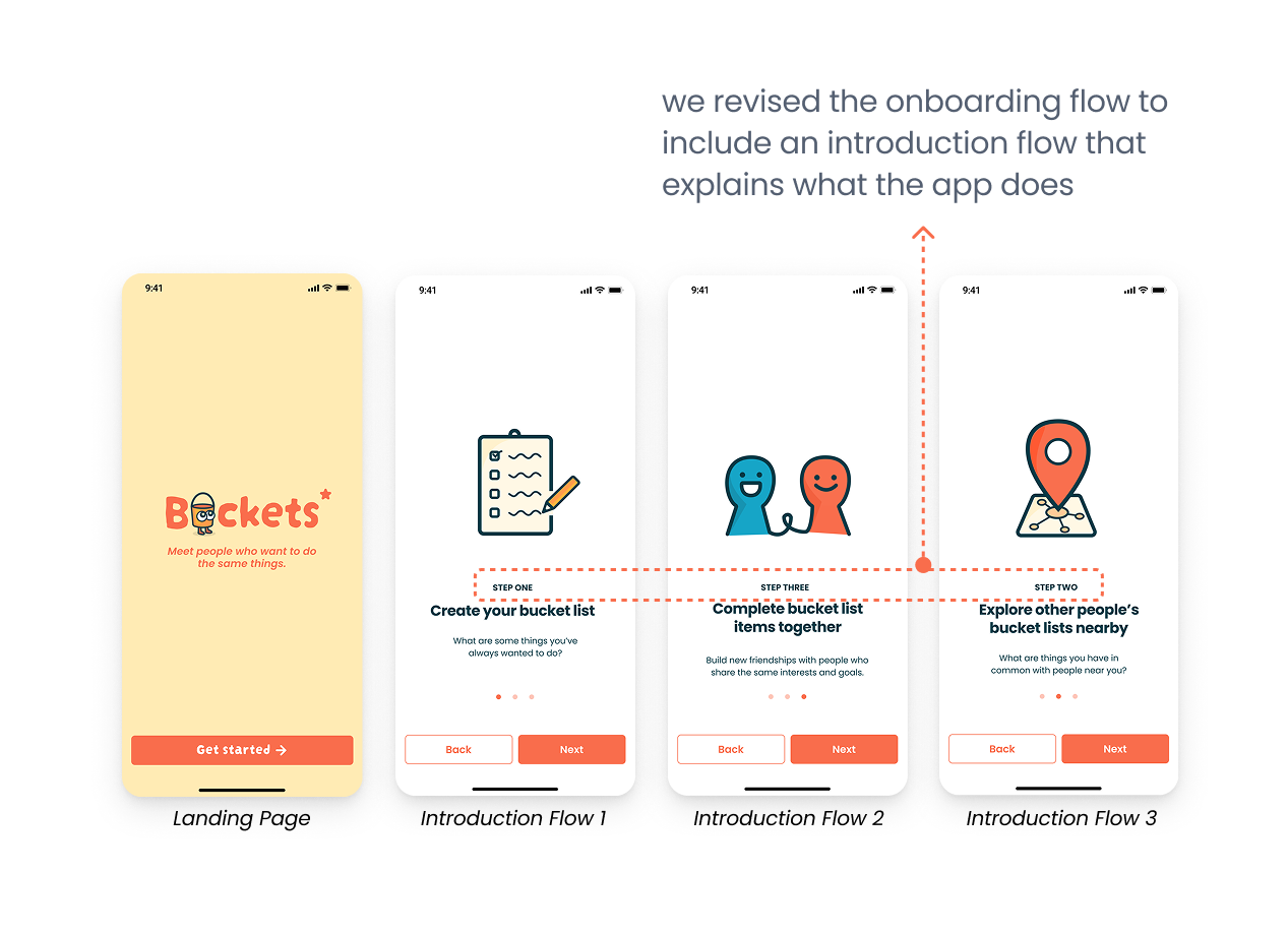
Early testing revealed users felt overwhelmed by too many choices upfront. We stripped onboarding back to three essentials: interests, location, and one bucket list item.
Sketches & Concept Exploration
We explored a wide range of concepts before committing like memory scrapbooks and event-based social networks. Sketching helped us throw out ideas that sounded good until they were on paper. We landed on the shared bucket list model because it was the only concept that addressed both the "reason to meet" and the "reason to come back" problems at once.
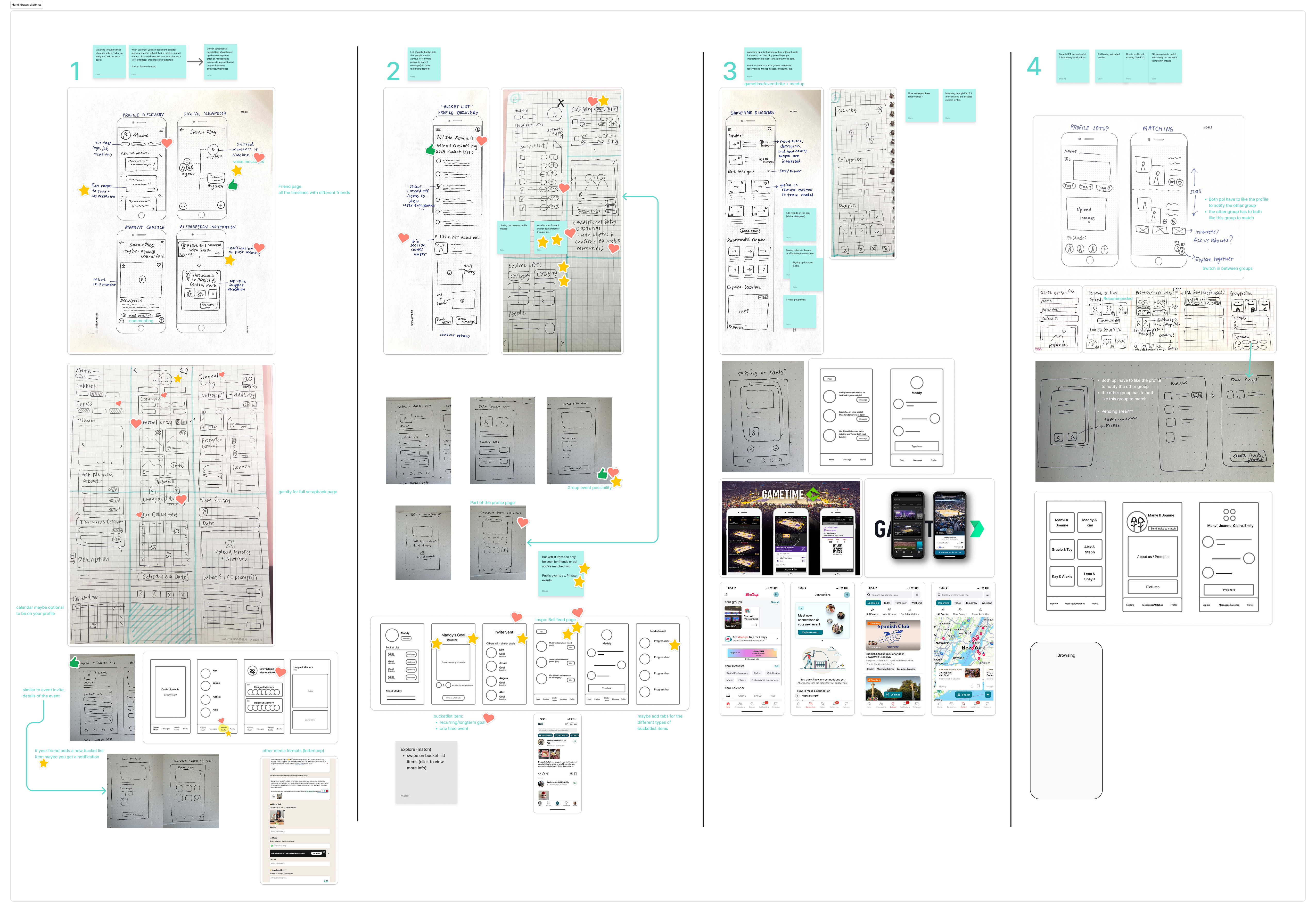 Early sketches of directions we explored before converging on the bucket list model
 Concept mapping of user journeys and feature priorities across different directions
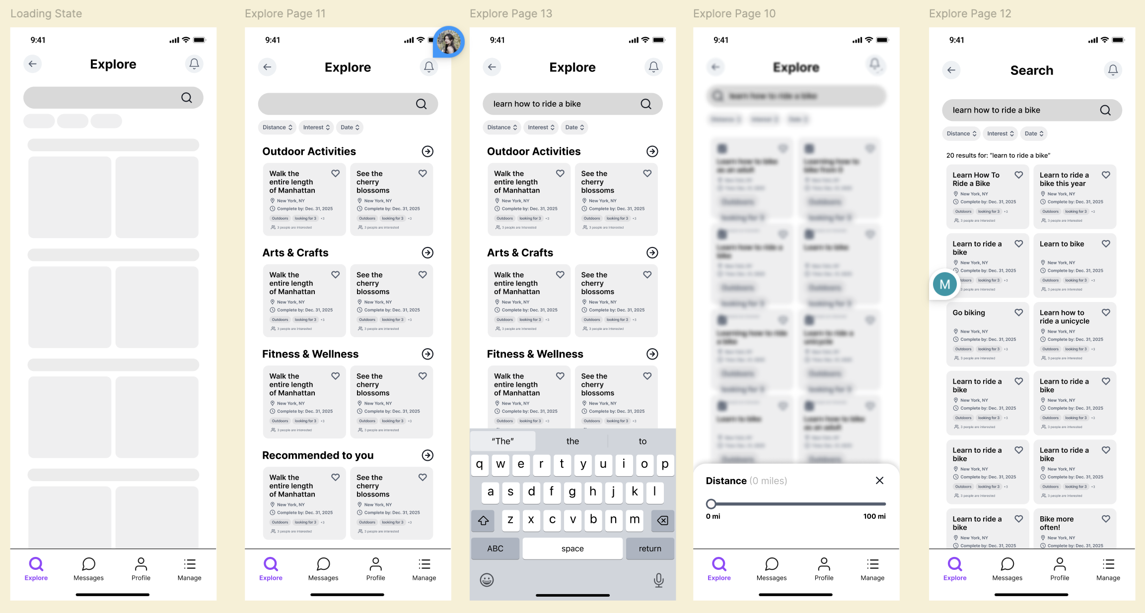
Low-Fi Wireframes
Testing basic flows for onboarding, creating listings, and exploring activities. We learned early that onboarding was asking too much with 6 screens of preferences before users could do anything. We cut it down to 3.
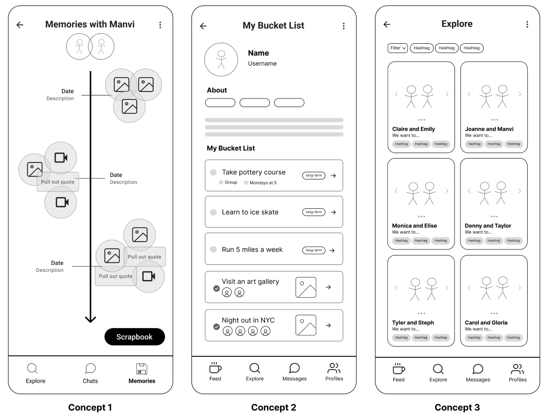
 Low-fi wireframes of navigation structure, onboarding flow, and activity card layout tested before any visual design was introduced
Usability Testing
7 usability tests surfaced one critical confusion: users couldn't distinguish "join" (request to participate) from "save" (bookmark for later). They kept doing one when they meant the other. We redesigned the action hierarchy and re-tested until it was clear.
 Mid-fi after testing of simplified onboarding, clearer join/save distinction, and restructured explore flow
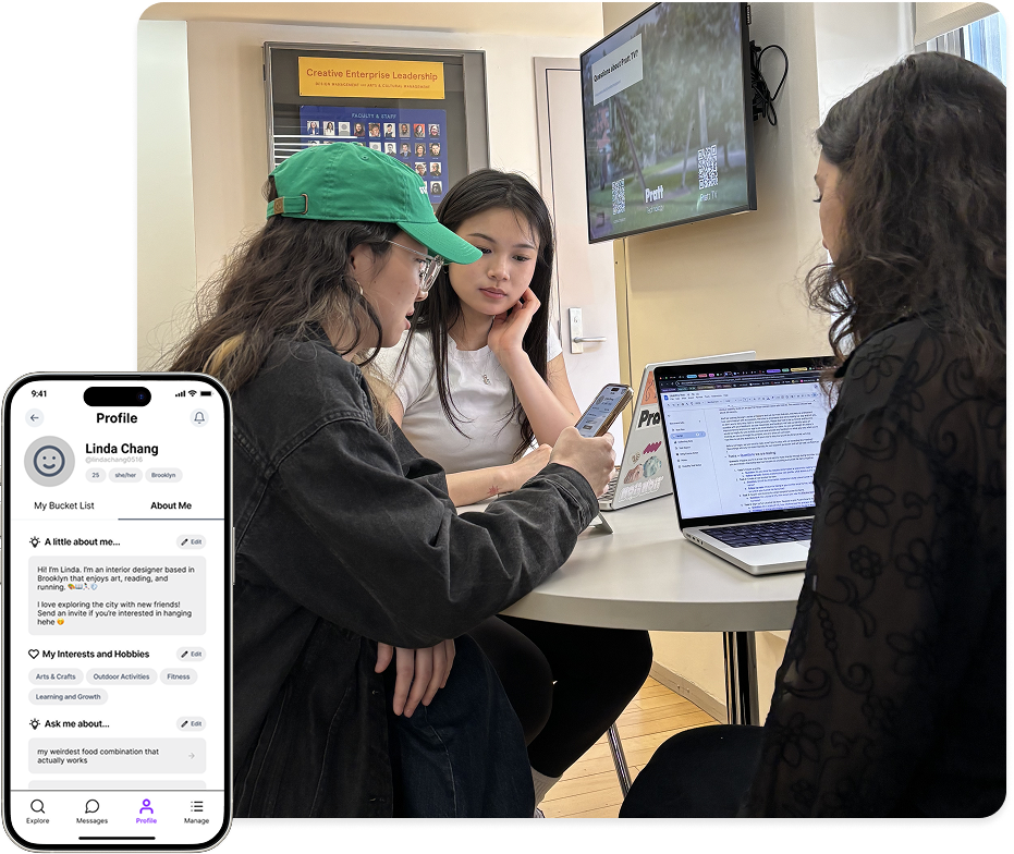 Usability testing where we observed participants navigate revealed the join/save confusion we couldn't have caught from interviews alone
High-Fidelity
Final mockups brought the visual identity to life with vibrant colors that feel energetic without being overwhelming. We chose Poppins typeface for its friendly rounded warmth and activity cards were designed to surface the image first because that's what people actually looked at.
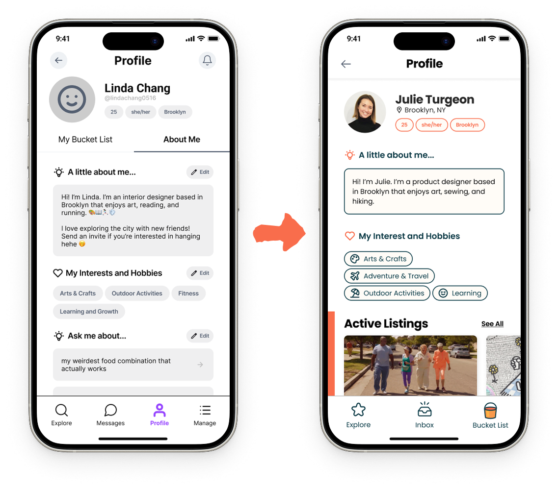 Mid to high-fidelity of profile screens where we kept the information minimal and focused on the active bucket list listings
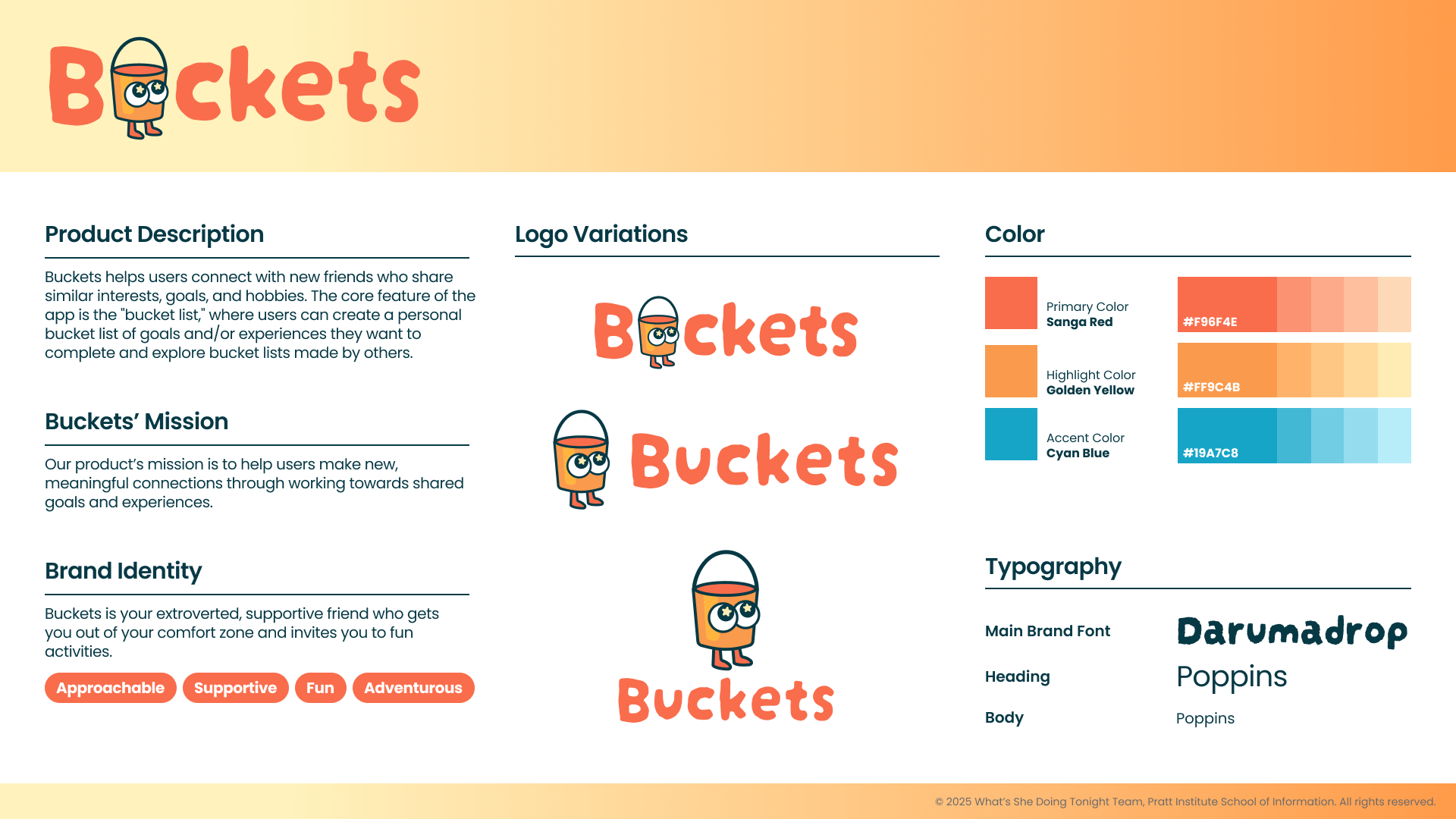
Energetic, warm, and approachable.
We chose sanga red and golden yellow for energy and cyan blue for calm. We used Poppins for its rounded friendliness. Every component was designed to feel inviting.
 Color palette of primary and secondary colors balanced for energy without overwhelming
 Typography Poppins for its friendly rounded character, scaled across heading and body sizes
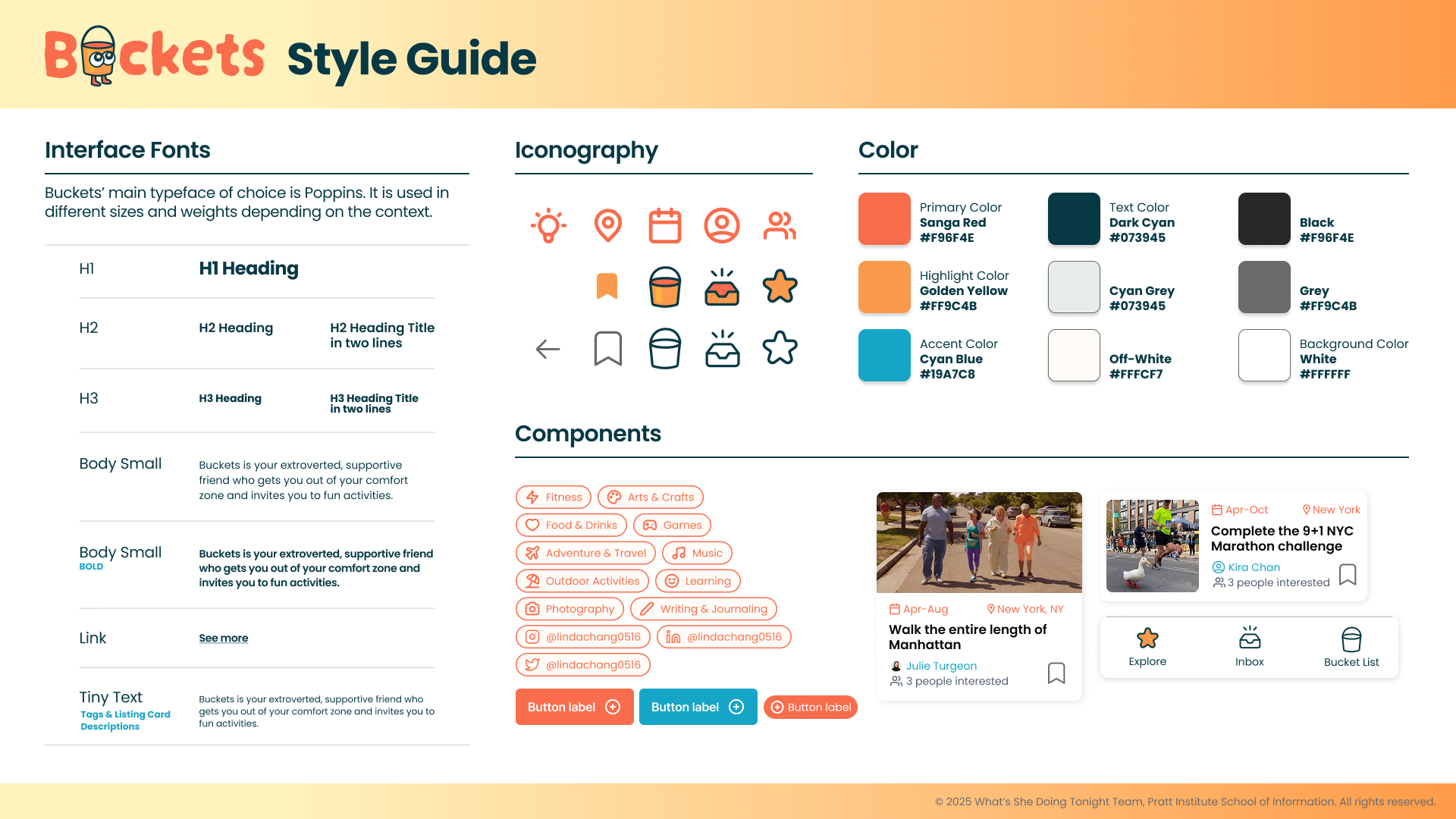
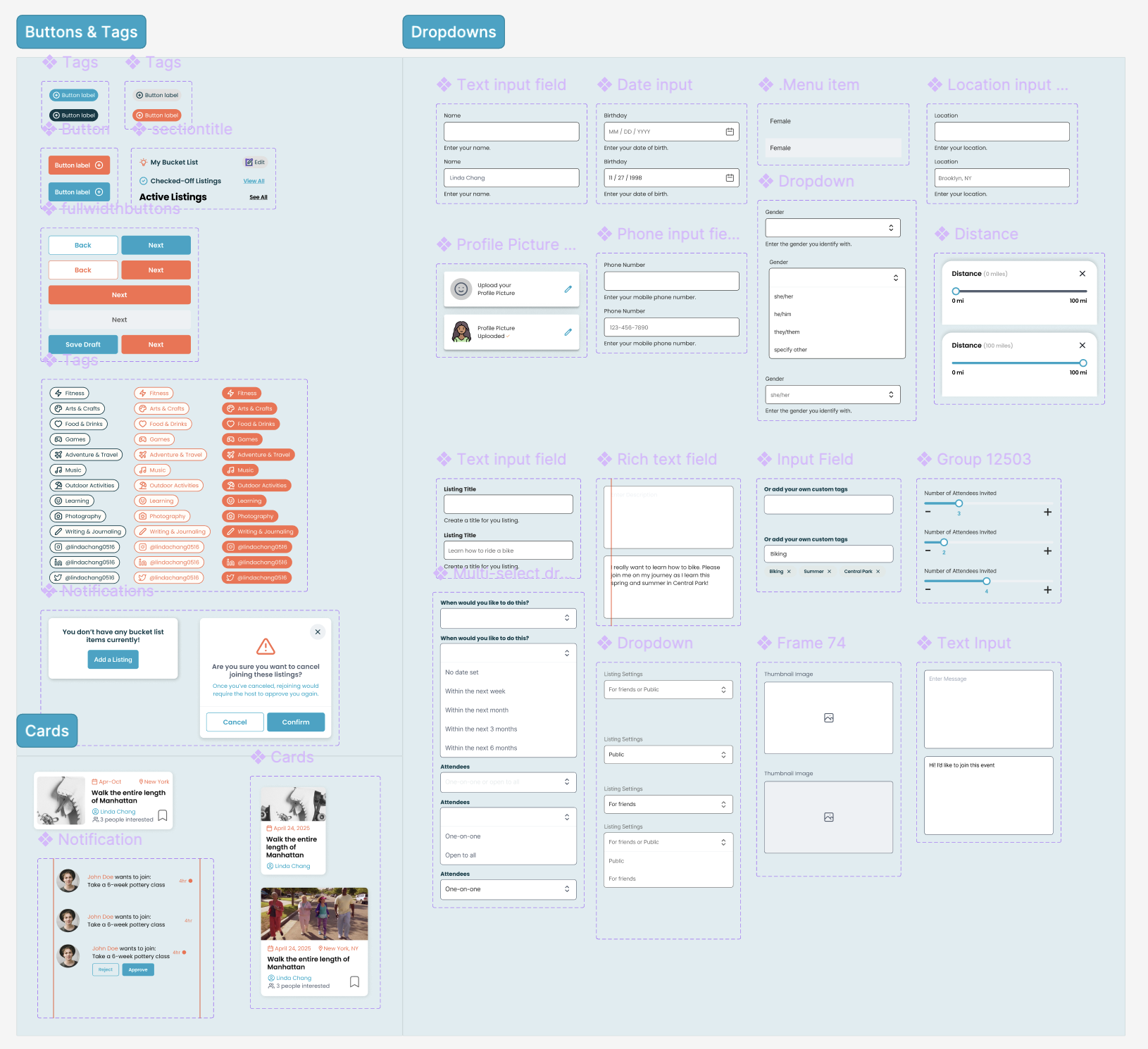 Component library of activity cards, profile chips, interest tags, and action buttons built for scalability
A complete journey from onboarding to meetup.
Six core screens, each addressing a specific friction point from research. Click a tab to explore.
Onboarding: For new users to get started quickly and feel welcome.
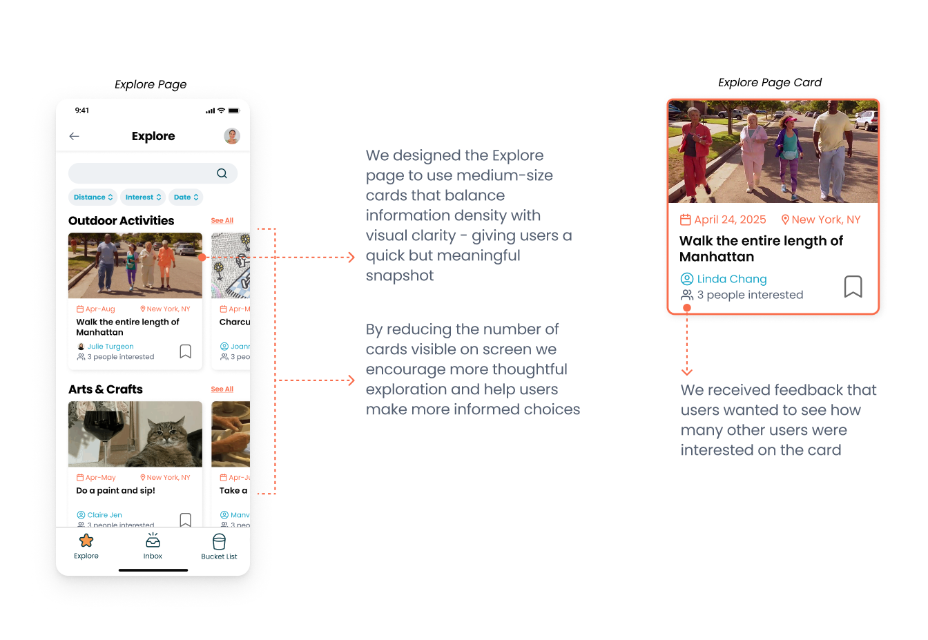
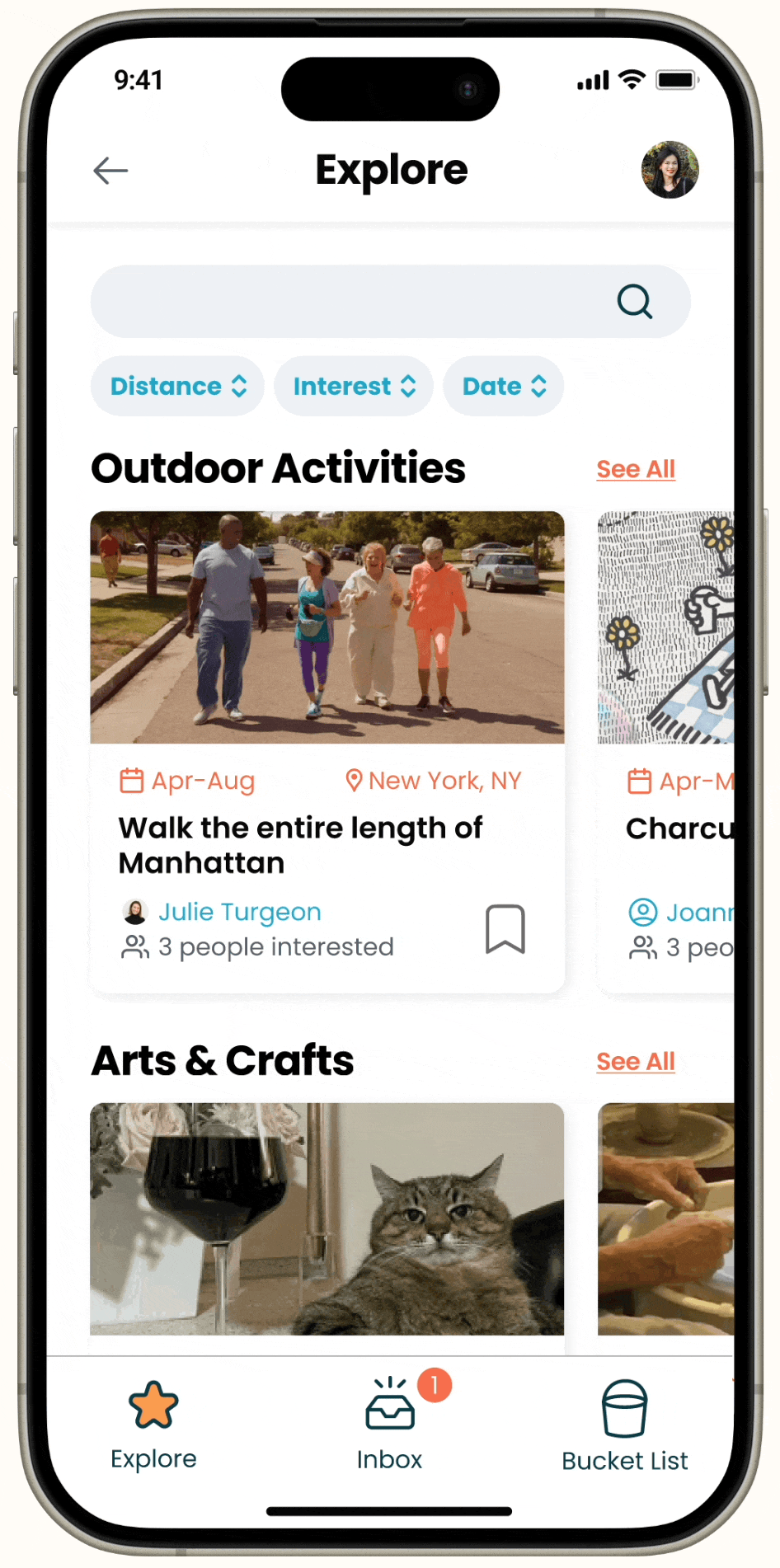
Explore: Browse bucket lists to join by category, distance, or type. Each listing shows who's already going so you can gauge the group before committing.
Create: List an activity and enter details like date range, group size, and where you want to meet.
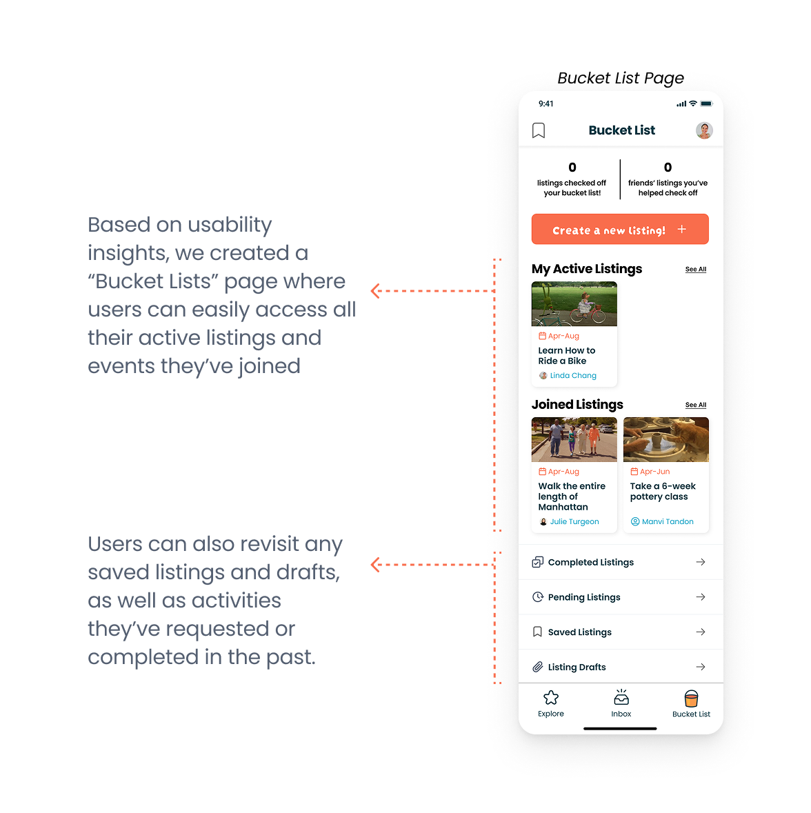
Manage: Track RSVPs, see joined listings, and manage your activities.
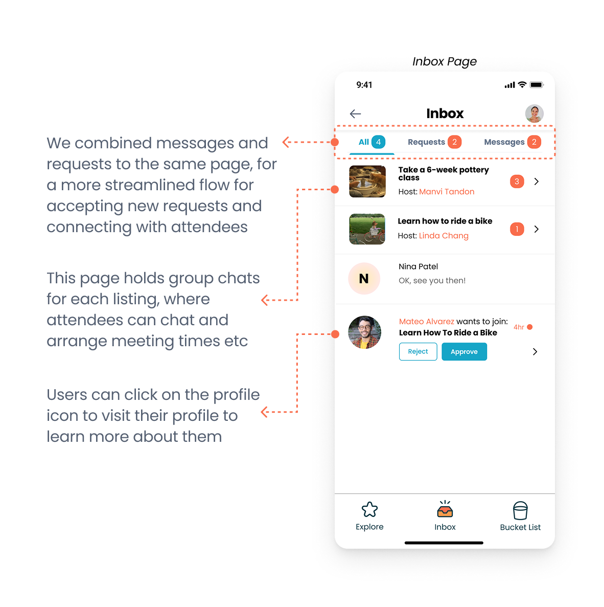
Chat: Group chat opens automatically when you join a bucket list. Activity details are pinned so everyone stays on the same page.
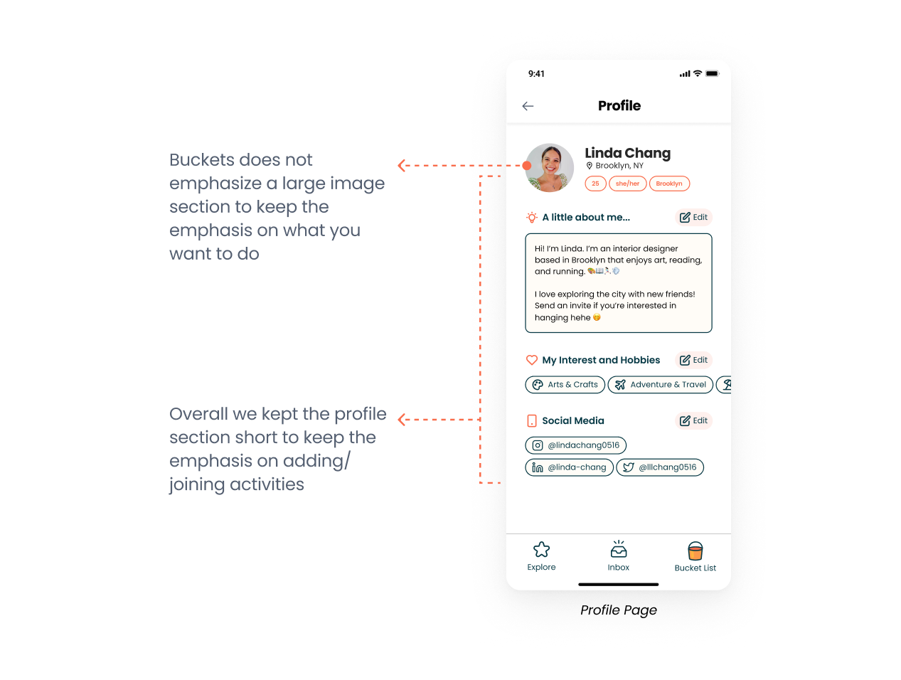
Profile: Your bucket list becomes your social identity. Shared experiences build your profile over time not a photo and a bio.
What I learned
Become your users, especially for something this personal.
I tried existing friendship apps and experienced the awkwardness of not knowing how to start a conversation myself. That experience changed how I made decisions. You can't interview your way to empathy, at some point you have to feel it yourself.
Design for the second hangout, not the first.
Every other friendship app was optimizing for the initial match. We kept asking: what makes someone come back? That reframe changed which features we prioritized like the post-activity prompt, the group chat persistence, the ability to plan future meetups from within the app.
When users are confused, observe why.
We wouldn't have caught the join/save confusion from interviews alone. Watching participants navigate the prototype in silence revealed it in under two minutes. Usability testing wasn't a validation step it was one of the generative research method we used.