

Building a design system for a nonprofit film center from scratch.
JBFC needs a design system that actually scales.
The Jacob Burns Film Center is a nonprofit film and arts center in Pleasantville, NY. The center provides educational and film programs for the community. Their site held useful information, but lacked consistency. Each page felt independently designed.
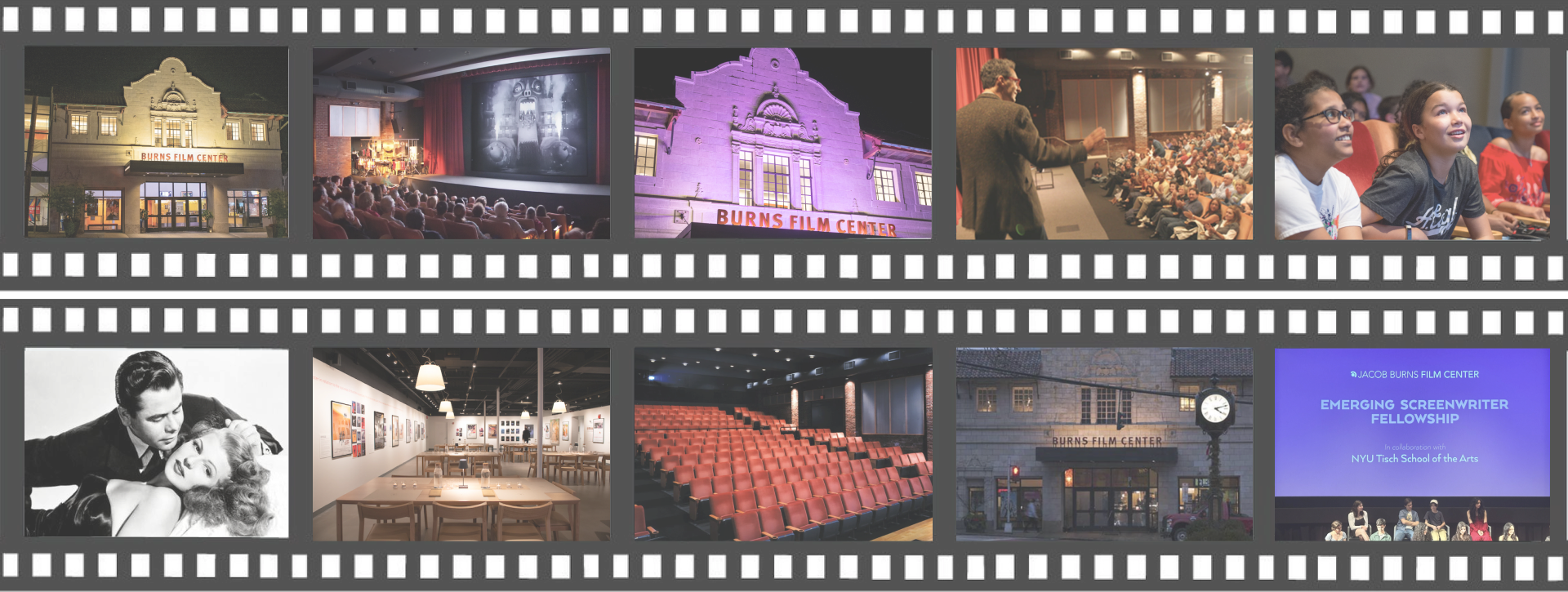
My team built Montage, a comprehensive design system to unify JBFC's platform, make it accessible, and give the internal team useful tools.
Our approach
Start with the mess
We ran a full UI inventory to document all the components currently on the website before re-designing in Figma.
Accessibility first
We incorporated WCAG accessibility guidelines into each component's definition and anatomy.
Build for adoption
We wanted to design a system that designers and developers could use, not just well-organized files with no guidelines.
The site had grown organically disjointed.
When we audited the live site, the scope of design debt was evident. The current site had:
- 20+ shades of gray: all used inconsistently throughout the site.
- No shared components: each page rebuilt the same buttons and cards in a different way.
- Accessibility wasn't on the radar: contrast failures and missing focus states throughout every core flow.
 The existing site was dense, inconsistent, and inaccessible. Every page was slightly different and information was scattered.
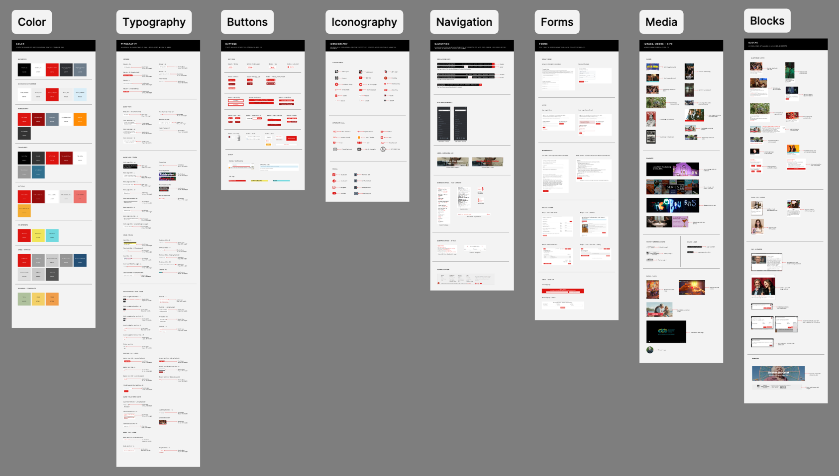
Montage: 50+ components, semantic tokens, living docs.
The system covers the full stack of color and type tokens, reusable components with documented variants, and full page templates; all synced to a Zeroheight site that updates automatically when Figma does.
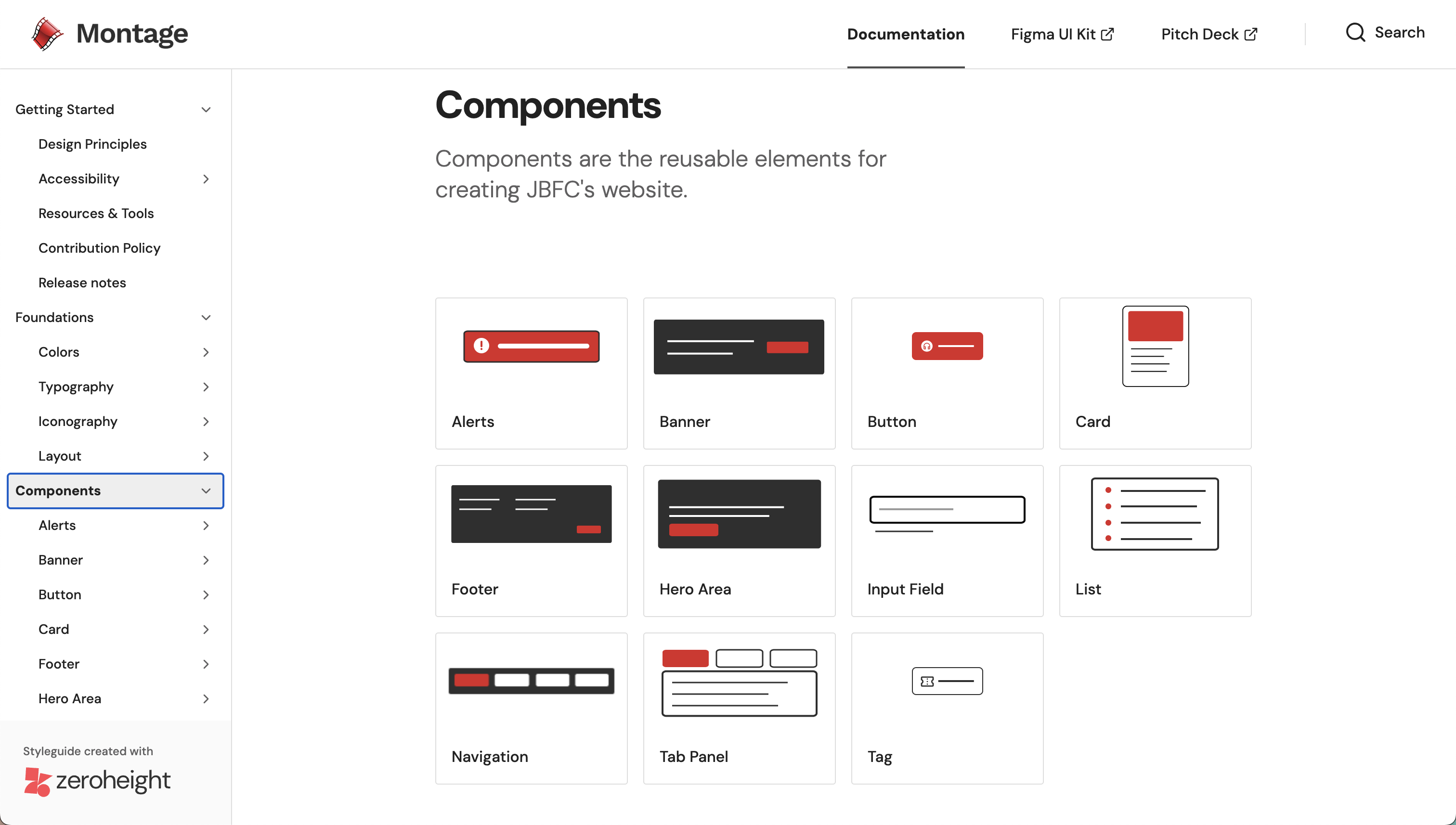 The component library consists of buttons, cards, navigation, tags, and more with all states documented
Validating our solution
We ran internal sprints where designers built landing pages entirely from Montage components. A page that used to take a full day to design could now be made in under an hour.
 Drag, configure, and ship with Montage. No CSS edits, no detaching instances, and no worrying about accessibility.
Before & after
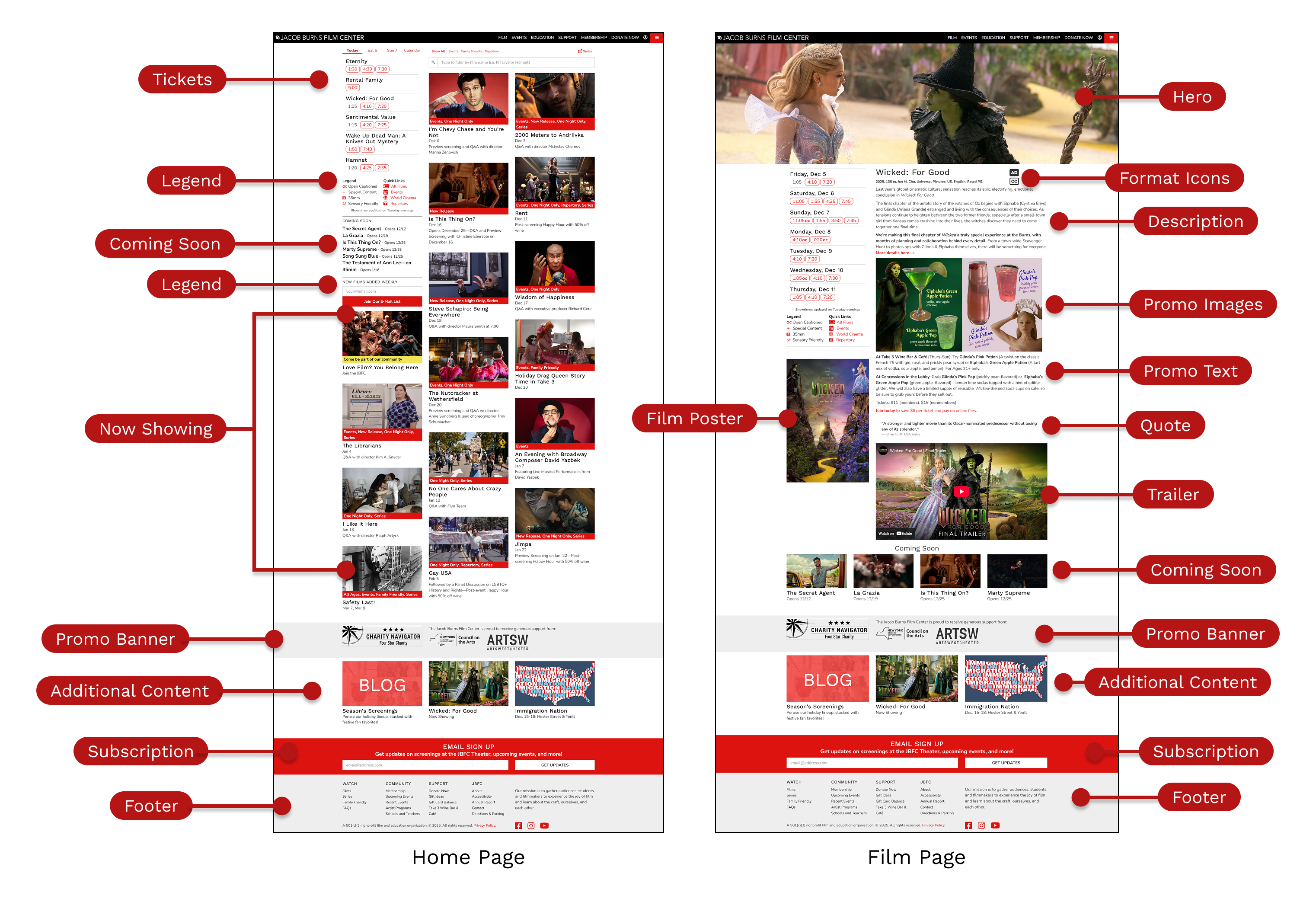
We applied Montage to JBFC's two highest-traffic journeys: the homepage and membership flow.
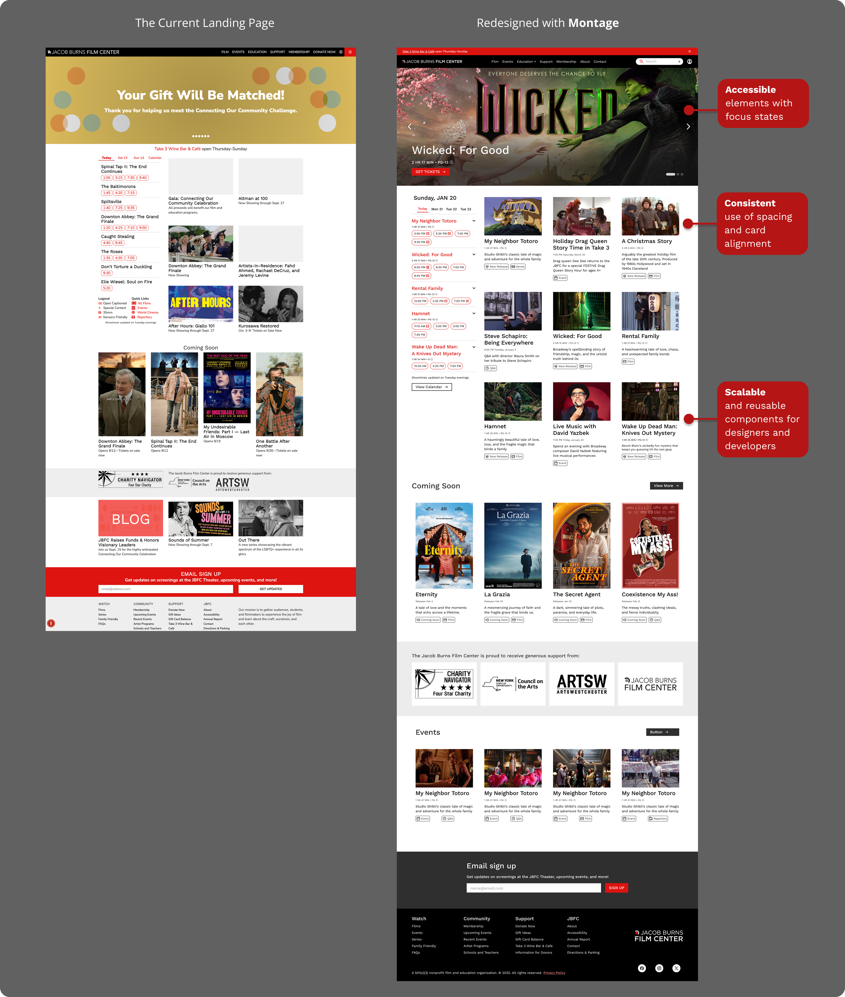 Homepage with Montage: intentional whitespace, a consistent type scale, and components that actually talk to each other
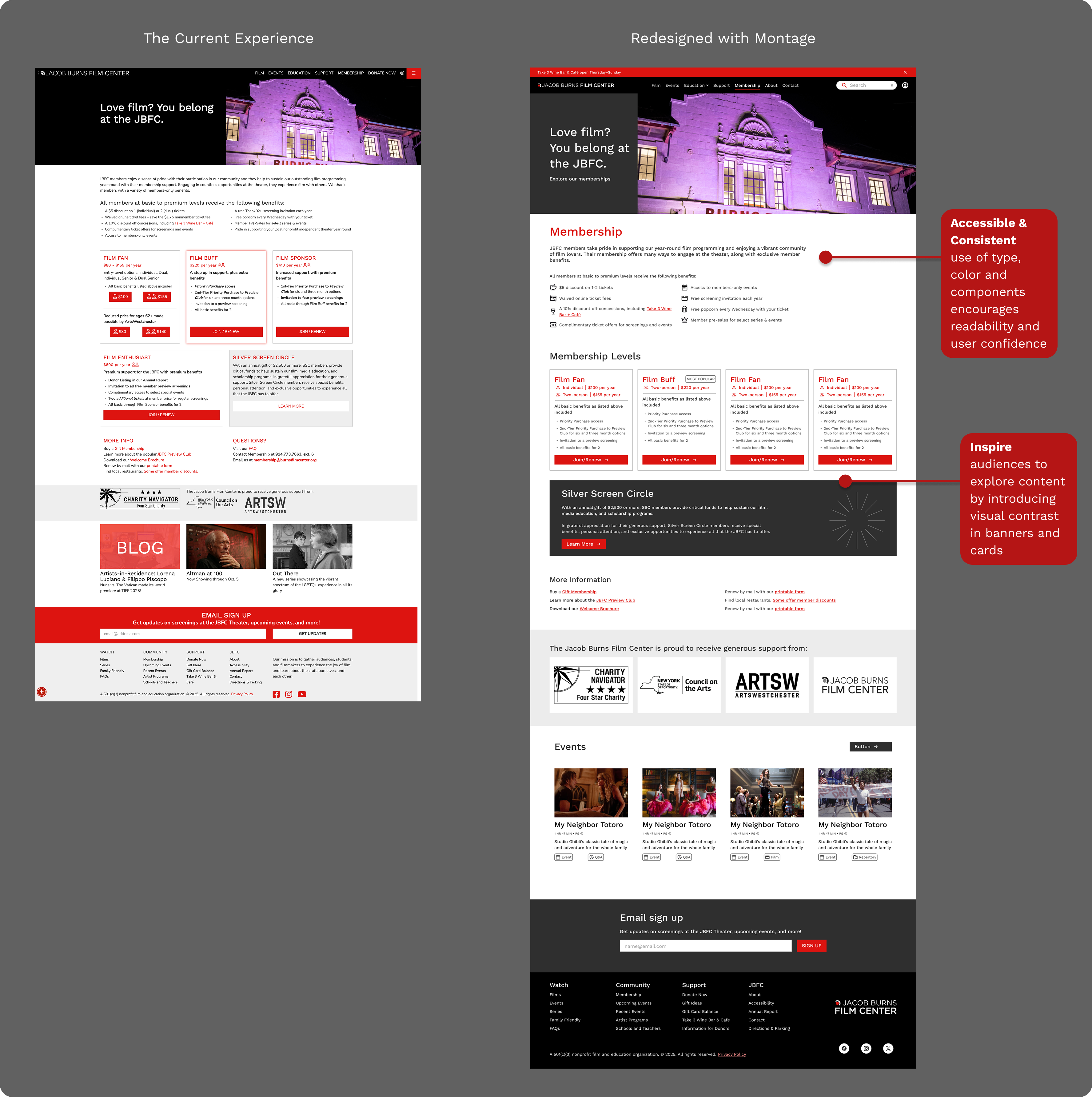 Membership with Montage: same offerings, clearer messaging, and still unmistakably JBFC
Documentation that doesn't go stale
We built the docs on Zeroheight, which syncs directly with Figma. Token updates and new components are reflected immediately with no manual exports.
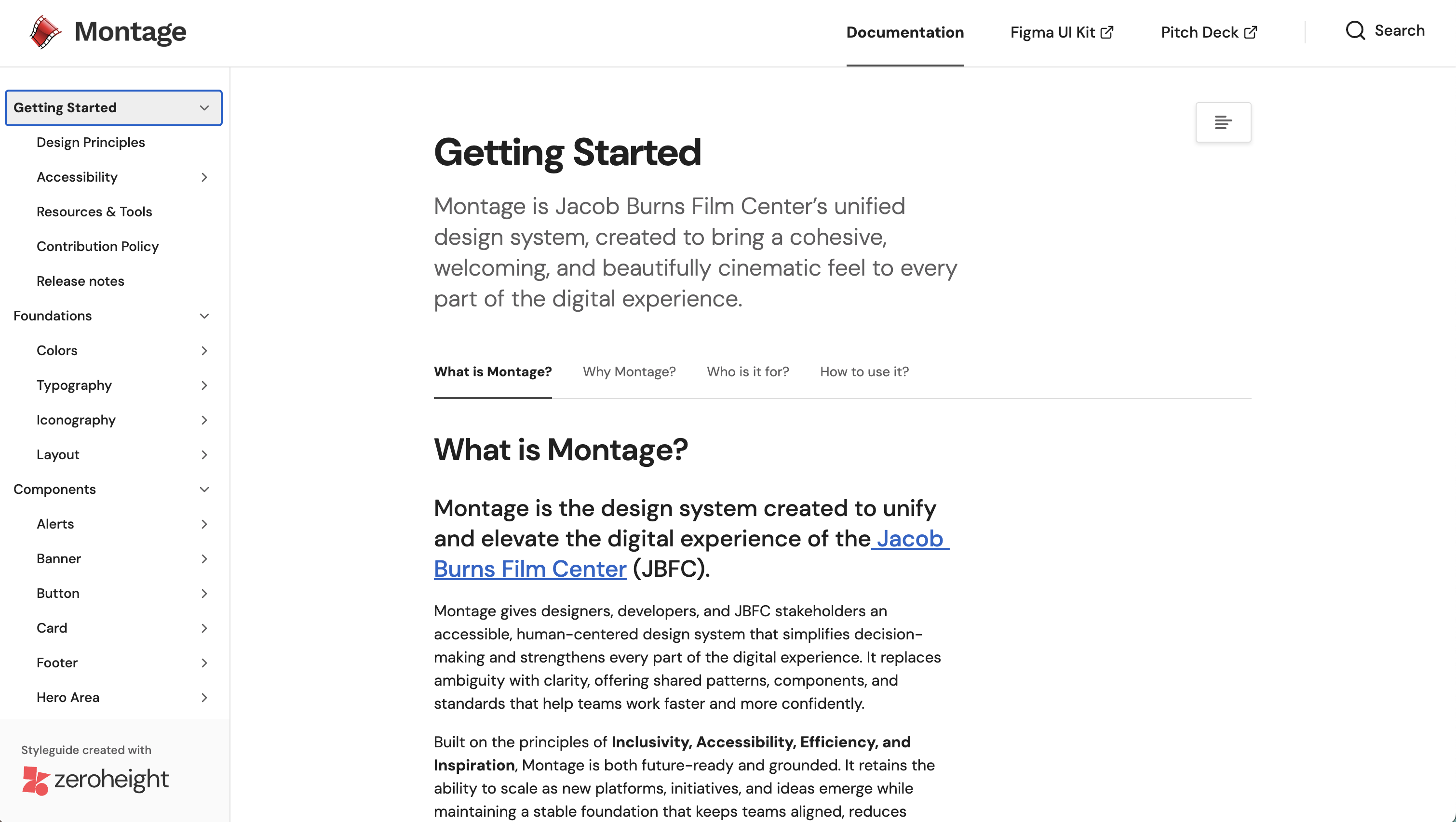 The living documentation site contains usage guidance, do/don't examples, and embedded Figma components.
Good design systems don't start with pretty components.
UI Inventory & Audit
We dismantled the existing site into atomic parts documenting every color, type style, spacing value, and UI pattern. The inventory revealed 20+ gray values, four distinct button styles, and three navigation patterns that all behaved differently. Seeing the full picture was the easiest way to understand the scope of the problem.
 The UI inventory of the current site revealed every inconsistency before we redesigned anything.
Semantic Design Tokens
Instead of "gray-4" we created --color-surface-background. Instead of "red" we created --color-link-hover. Every token maps to a meaning, not just a value, and they live in Figma Variables mapped 1:1 to CSS design tokens. We structured this so the design-to-dev handoff can be frictionless.
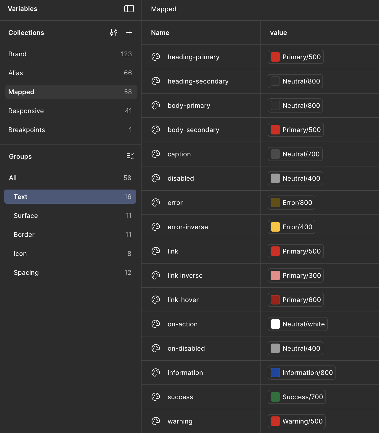 Semantic color tokens where every value has a role, not just a hex.
Component Architecture
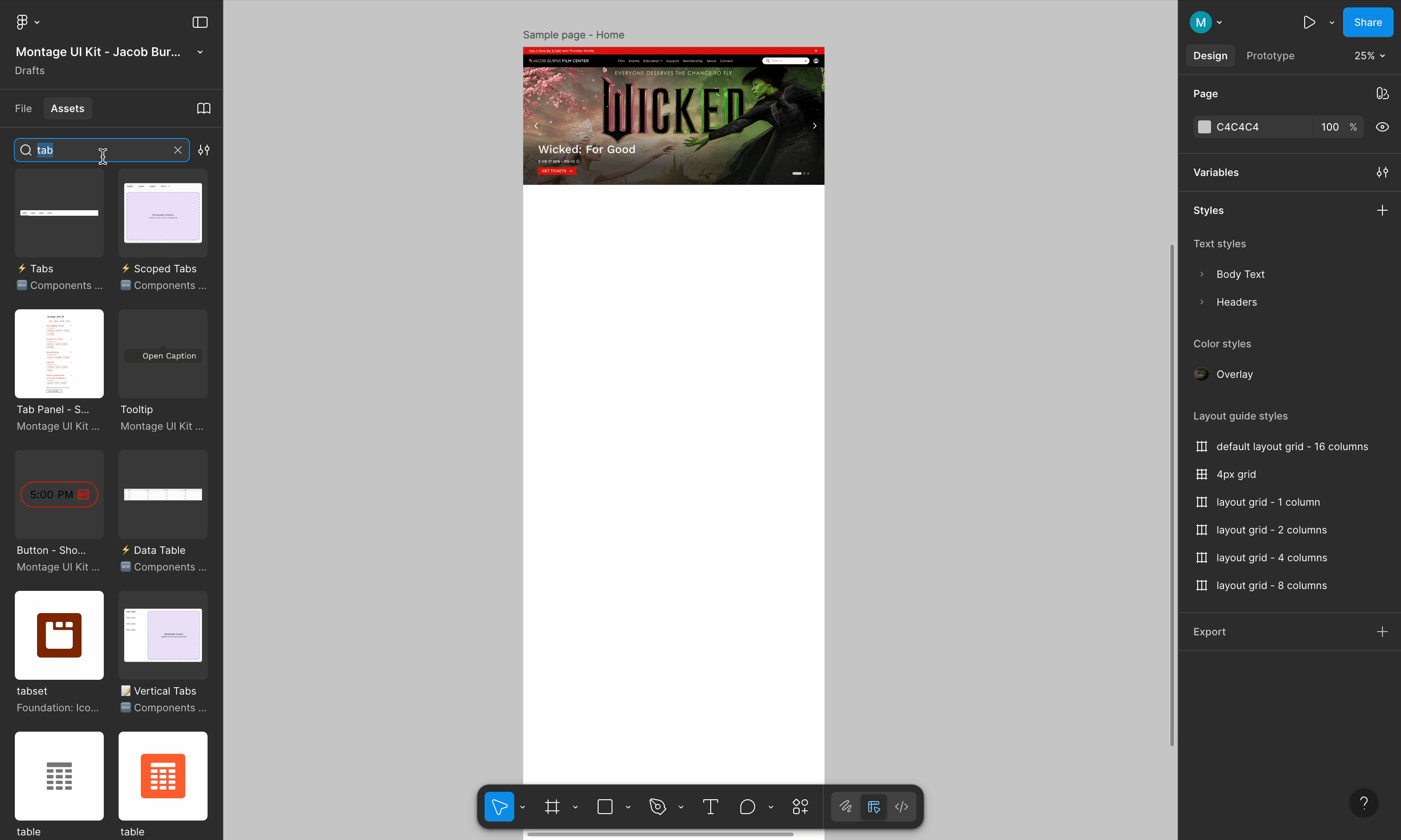
We used Figma's Component Properties like Booleans, Instance Swaps, and Nested Variants to build a library that's flexible without being fragile. Designers configure size, state, and content from the sidebar. No detaching or manual overrides that break on update.
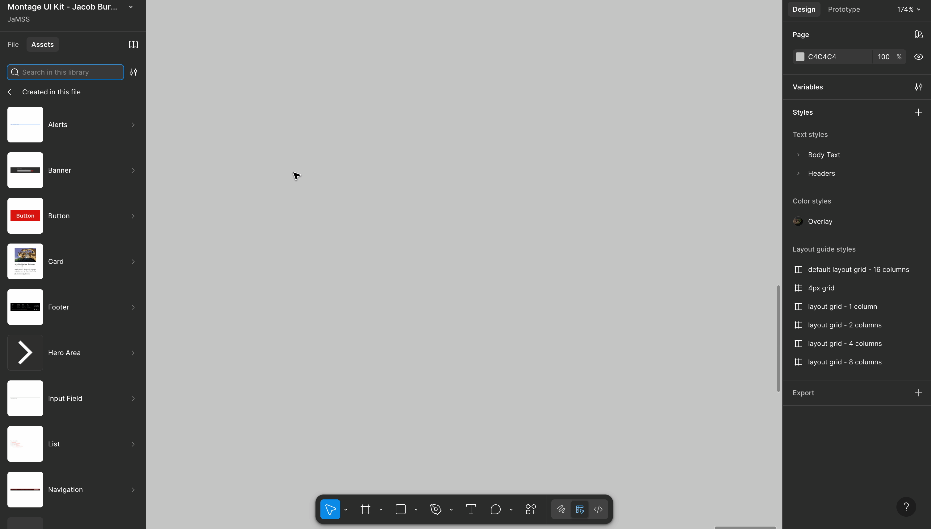 Toggling states and sizes entirely from the sidebar to keep customization and usage flexible.
Accessibility as a Constraint, Not a Checklist
Every component required passing contrast checks, keyboard navigation review, and focus-state testing before it could be finalized. We used Figma's Contrast plugin alongside manual browser testing to check accessibility contrasts.
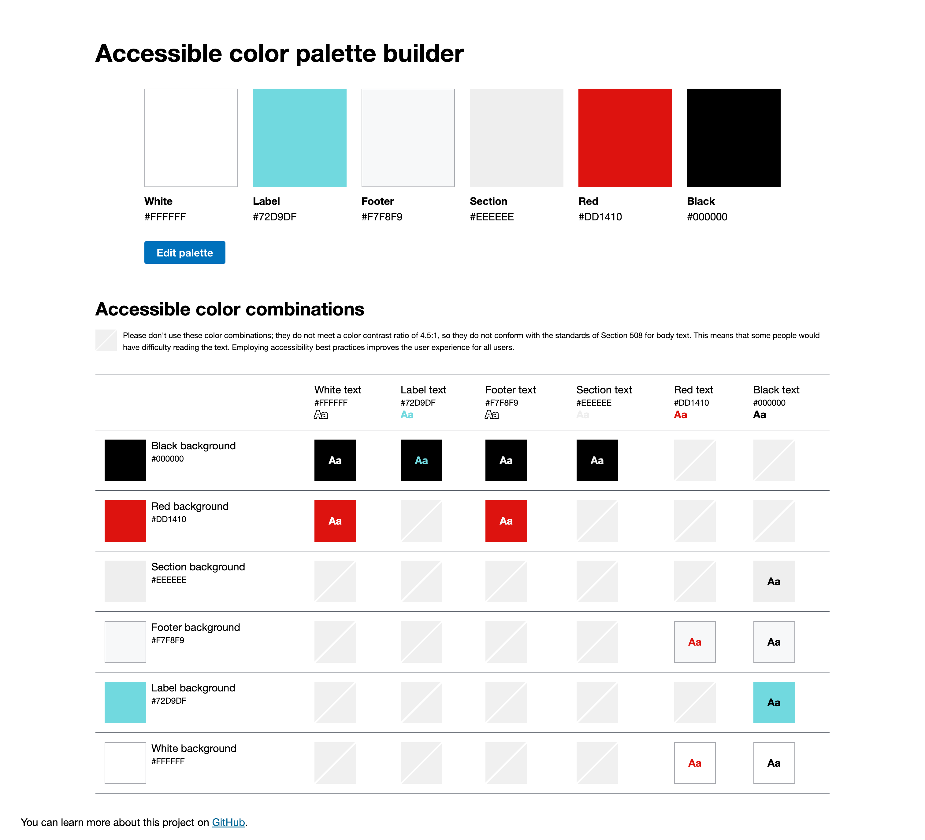 Contrast ratios at every interactive state to ensure accessibility across default, hover, focus, and disabled states.
It not only looks better but it works better.
We validated Montage with internal designer testing. The results were evident, designers were able to create faster builds, achieve full accessibility compliance, and were excited to use Montage.
The components are clean and intuitive and save me so much time.
— Designer feedback, internal usability testing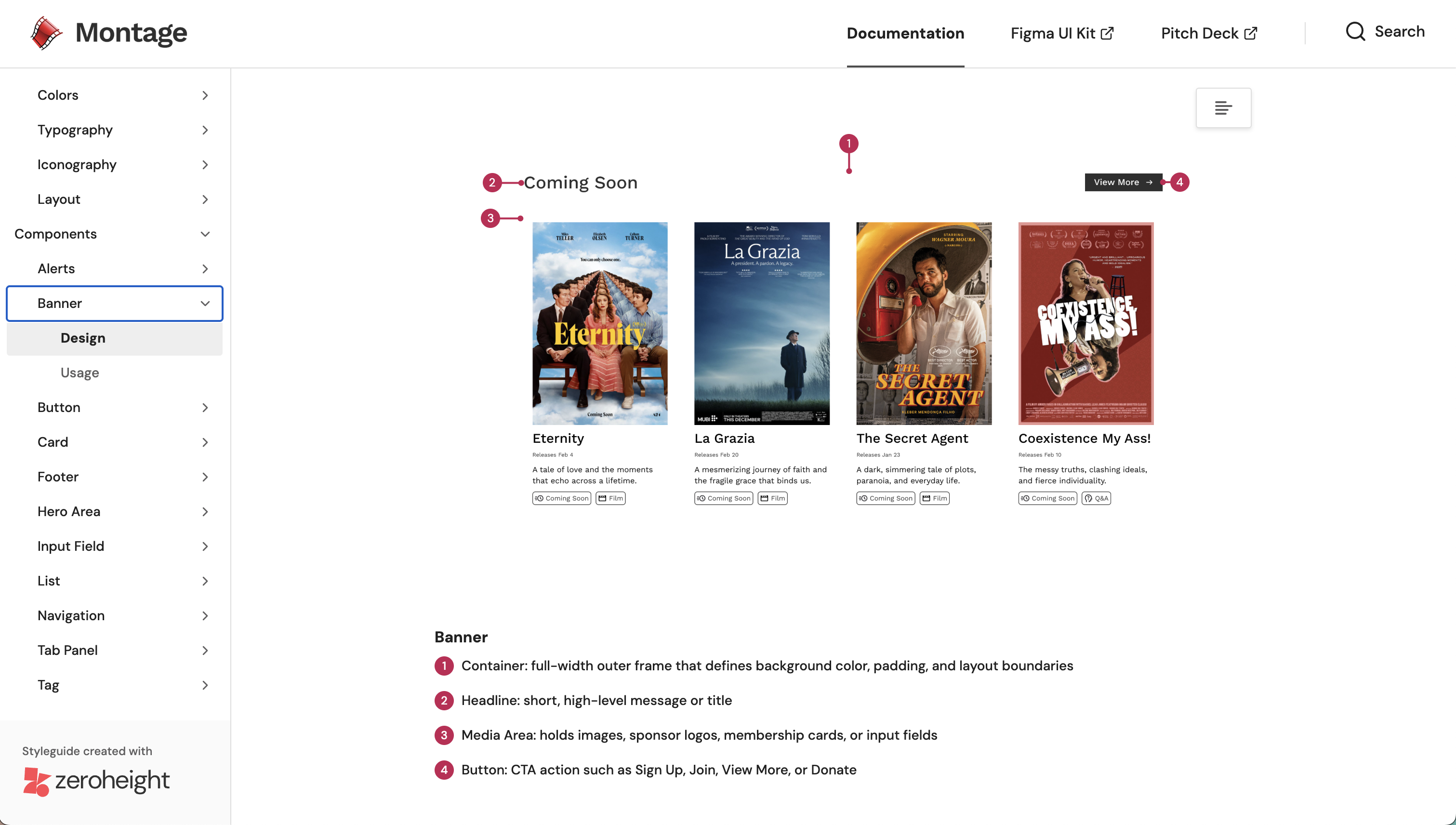 Montage makes it easy to create accessible designs that scale with the site.
What I learned
Adoption is a design problem too.
The hardest part wasn't building the components, it was getting people to trust them. It was crucial to keep JBFC's spirit alive in the new system while also adding efficiency, consistency, and accessibility. A design system is a tool that designers and developers use, not just a collection of files.
Retrofitting accessibility is significantly harder than starting with it.
The audit showed how fast issues compound. When accessibility is a constraint from day one it makes a system easier to maintain and scale.
Think in patterns, not pages.
The biggest shift was moving from "how should this page look?" to "what pattern does this page need?" When you're designing the system itself, you start catching inconsistencies before they ever get built.
Design systems are culture change disguised as a UI kit
— Lauren LoPrete