Redesigning a museum's digital experience for the community it actually serves.
Making Kerala Museum accessible to everyone.
Kerala Museum has been an art and cultural museum in Kochi, India since 1987. In recent years, it's been transformed from a museum attraction into a community hub offering lectures, performances, multi-sensory exhibitions, and events for local families and students. But the website hasn't kept up. We partnered with the museum to fix that.
Kerala Museum is a progressive community center with a voice for the unvoiced
— Community member, user interviewThe site was built for museum visitors. The museum had become something more.
- Community members bypassed the site entirely. Visitors asked staff directly about upcoming events or caught updates on social media. The website wasn't a resource for the community.
- Accessibility and inclusion were missing. The site had inconsistent language and no local language support (despite serving a Malayalam speaking community).
- Navigation was overloaded. Subcategories with unclear labeling made core actions like buying tickets or finding events difficult.
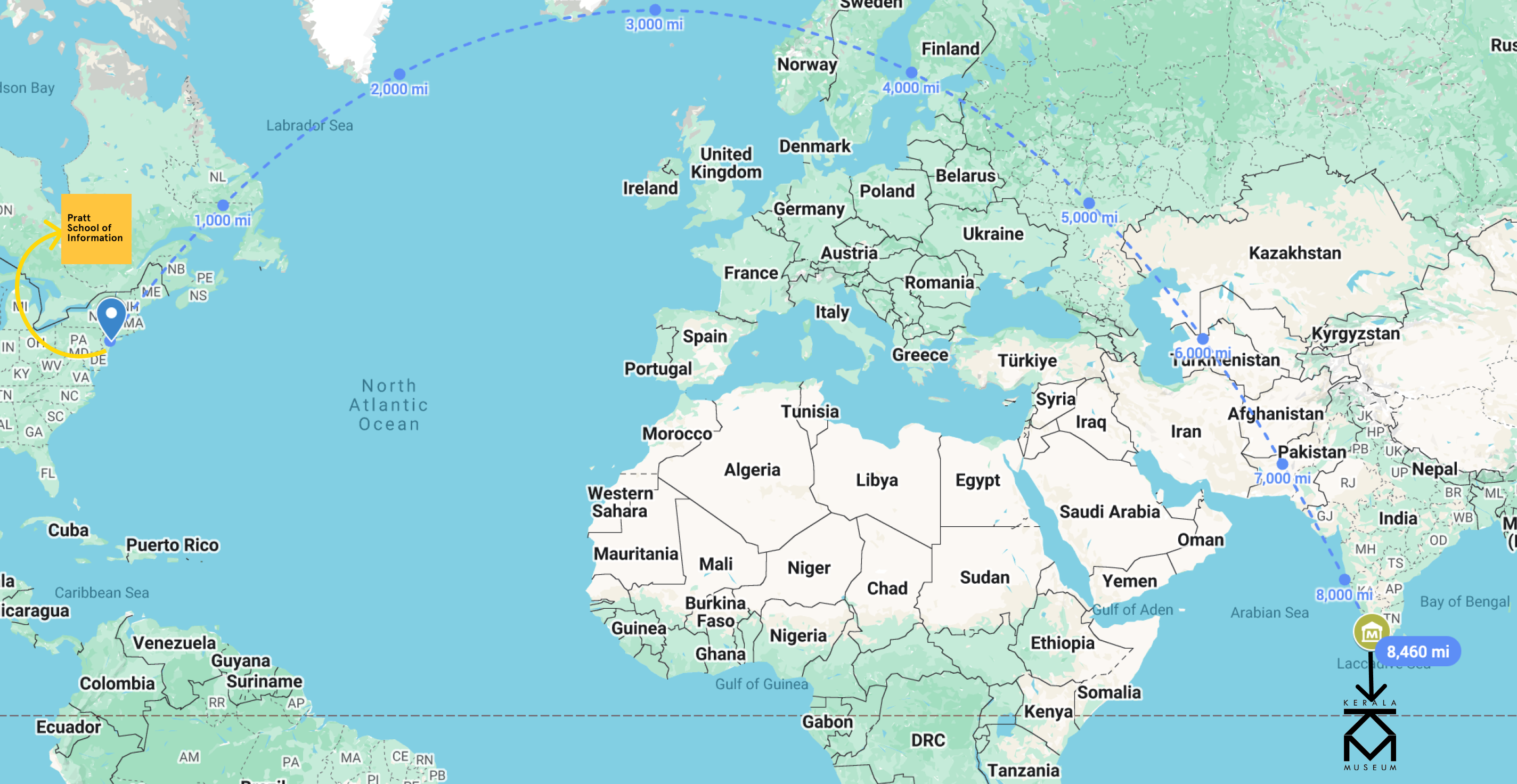 With over 8,000 miles between the design team and Kerala Museum we had to rely on user stories to understand the community needs
We couldn't visit so we interviewed, benchmarked, and tested everything.
Our research approach consisted of multiple rounds of user interviews. We spoke with local visitors (teachers, art enthusiasts, and event attendees) and museum staff to understand their needs. We also benchmarked against 13 cultural institutions and museums in India. We used tree testing to validate whether our proposed information architecture made sense to the community.
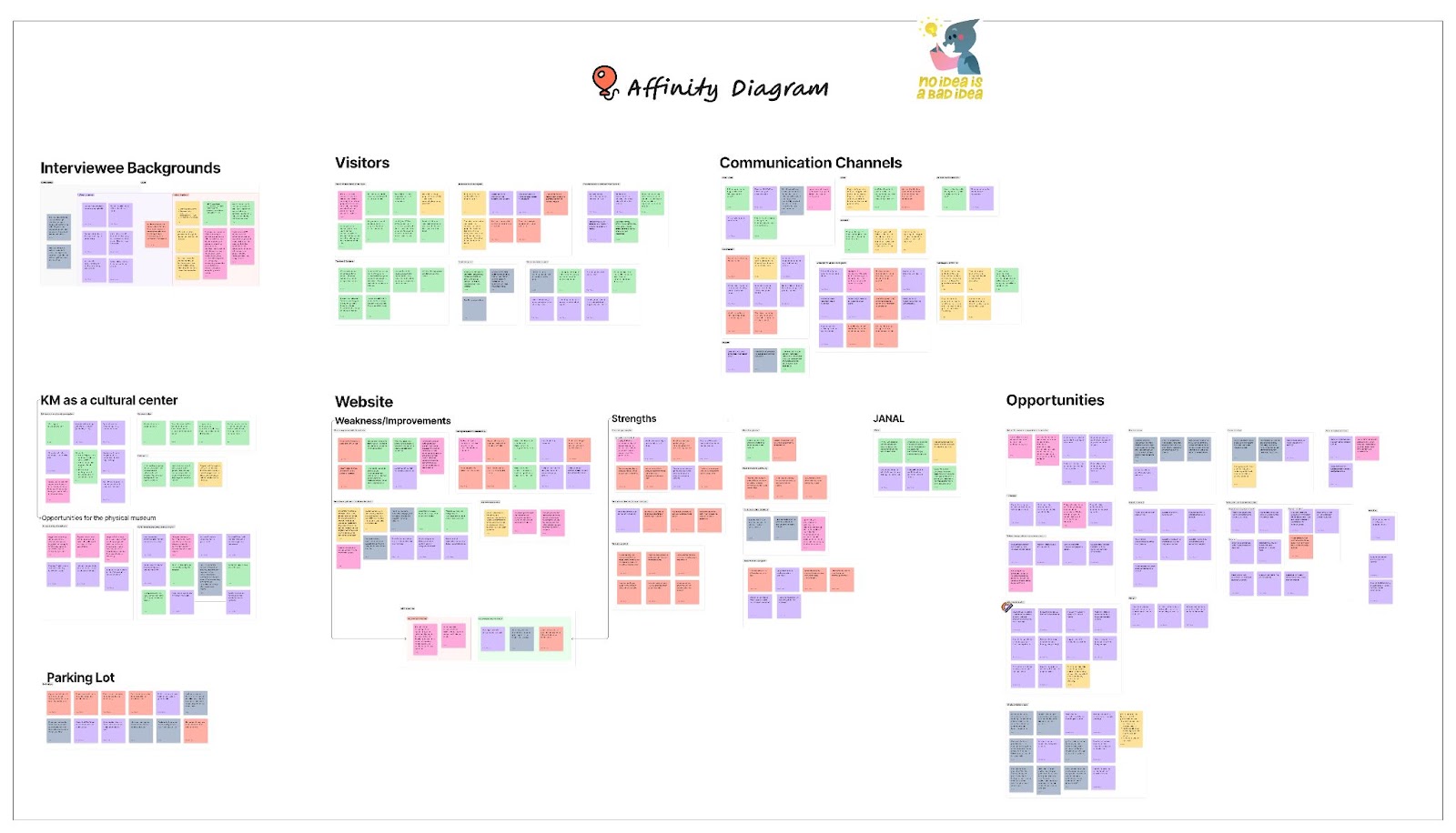 Affinity mapping across all interviews and grouping pain points, motivations, and unmet needs.
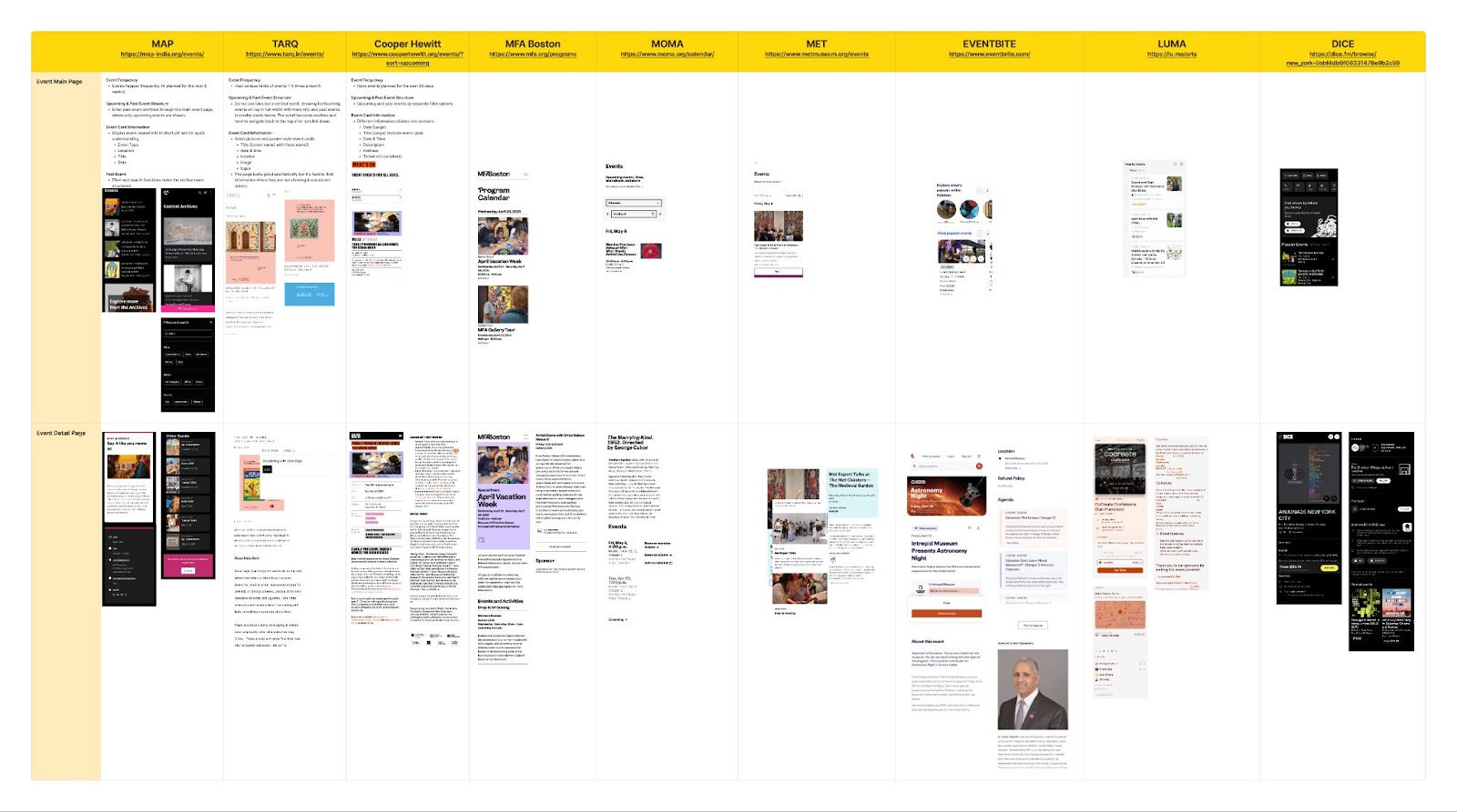 Benchmarking 13 museums, from National Museum of New Delhi to Kochi-Muziris Biennale, to understand user engagement at similar spaces.
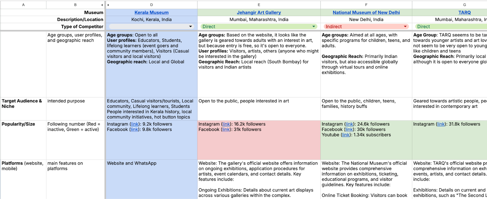 Full competitive analysis across accessibility, digital strategy, and community engagement.
Designing for the community
The museum's audience is wider than it appears. We identified four distinct user groups with different needs and motivations:
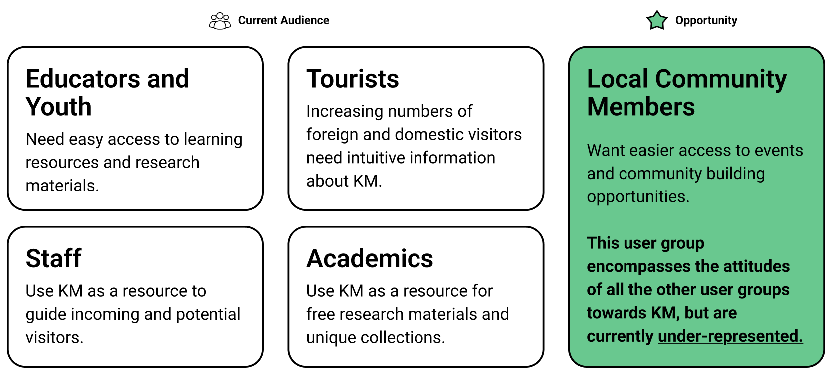 Four current target audiences revealed an opportunity to engage the local community more through the website.
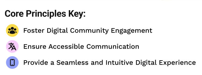
Principles that guided the community focused re-design
1. Foster digital community engagement
Help the community find events, share stories, and learn about culture, history, and art.
2. Ensure accessible communication
Design for multilingual support and remove the barriers that were stopping people from engaging.
3. Provide a seamless and intuitive experience
Simplify navigation and make content intuitive. One clear path to tickets, events, and visits.
 Our core principles informed every screen and helped us understand who it primarily serves.
Sketches & Low-Fi Wireframes
We started with sketches exploring navigation models, event discovery flows, and how to handle the multilingual requirement.
 Initial sketches exploring navigation structure and event discovery.
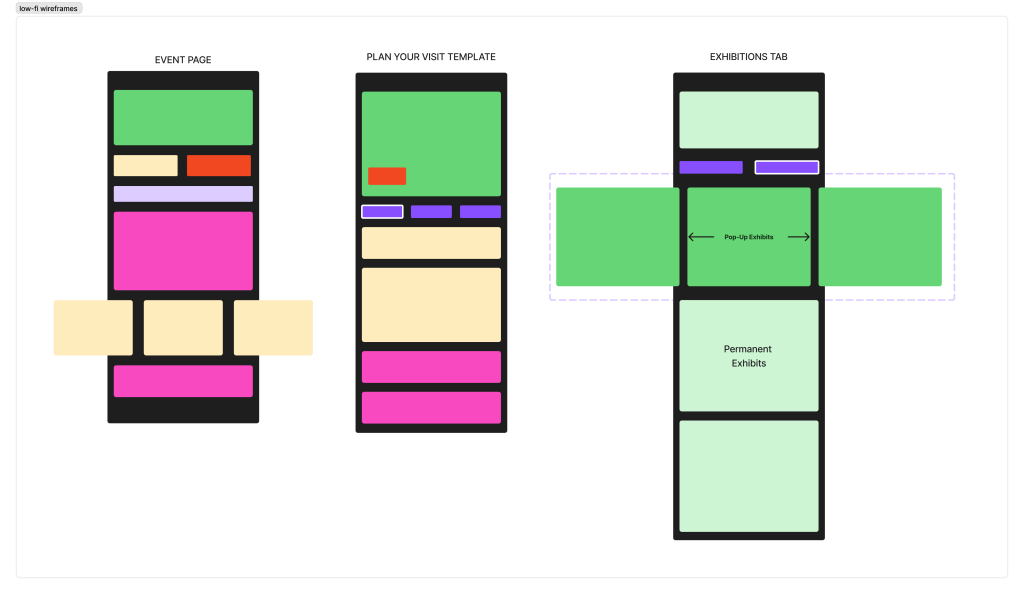 Low-fi wireframes testing information architecture for a mobile layout.
Testing Early and Often
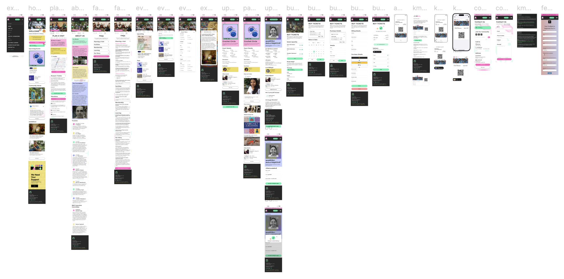
We tested three core flows with seven participants (in both Malayalam and English). The feedback was that navigation labels were confusing, the FAQ was important, and event filters could be expanded. We iterated on these features before moving to high-fidelity.
 Mid-fidelity after round one of testing with simplified labels, restructured event/FAQ discovery, and advanced filters.
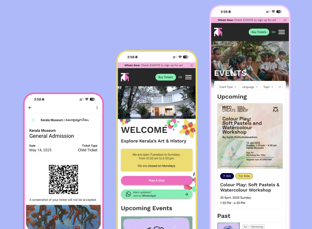
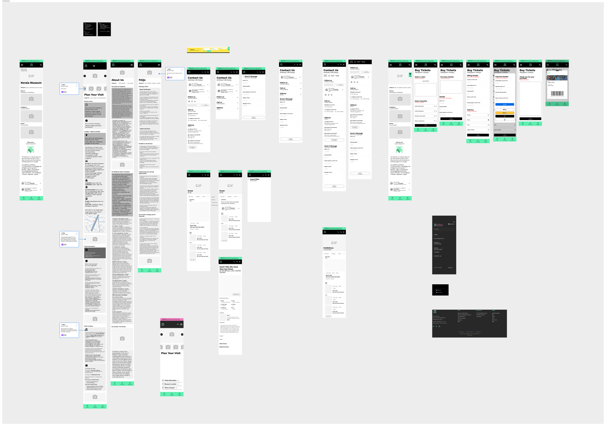
 High-fidelity mobile prototype with accessible event filters, clear navigation, and multilingual support.
A digital archive of past and upcoming events, museum collections, and streamlined access.
The final design applied our three principles across every core user journey from arriving on the homepage to buying a ticket. We wanted to ensure the community felt represented and informed by the website; we wanted the website to feel inviting, vibrant, and easy to use.
 The final website with event filtering and multilingual support.
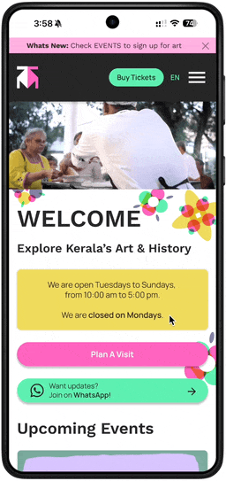
Homepage
Designed to help inform visitors of the museum's offerings and events.
 Homepage with engagement zones annotated and navigation cues designed to guide without overwhelming.
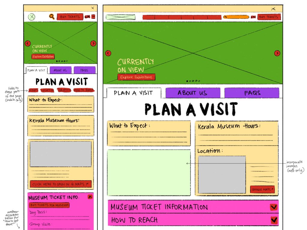
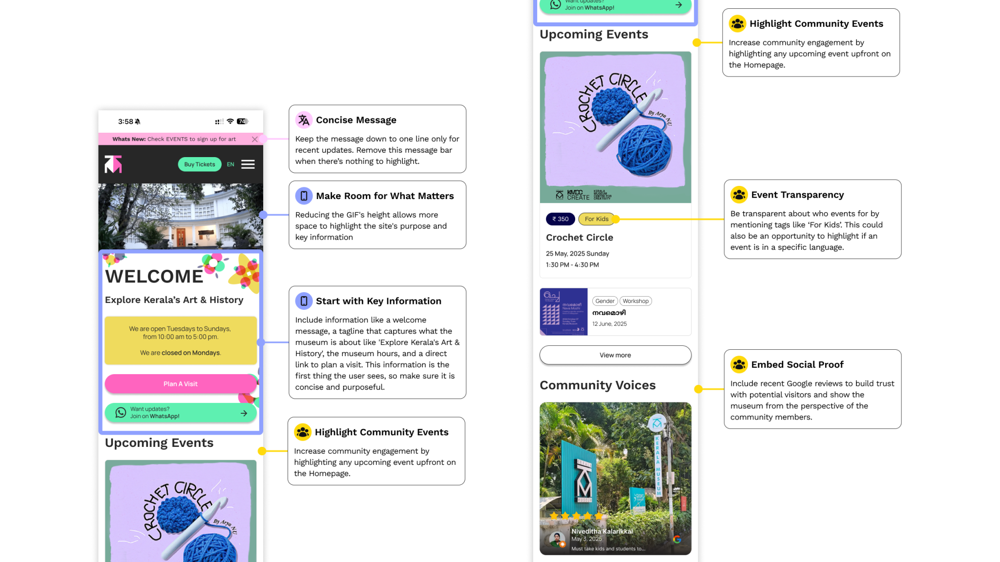
Plan a Visit
Curated messaging and a clear information flow replaced the old wall of text. Users can view hours, location, accessibility services, and FAQs in a single scroll.
 Plan a Visit contains clear information hierarchy with FAQ details surfaced prominently.
Events
The most requested feature was a proper event filtering system. Users can browse by event type, date, and language needs.
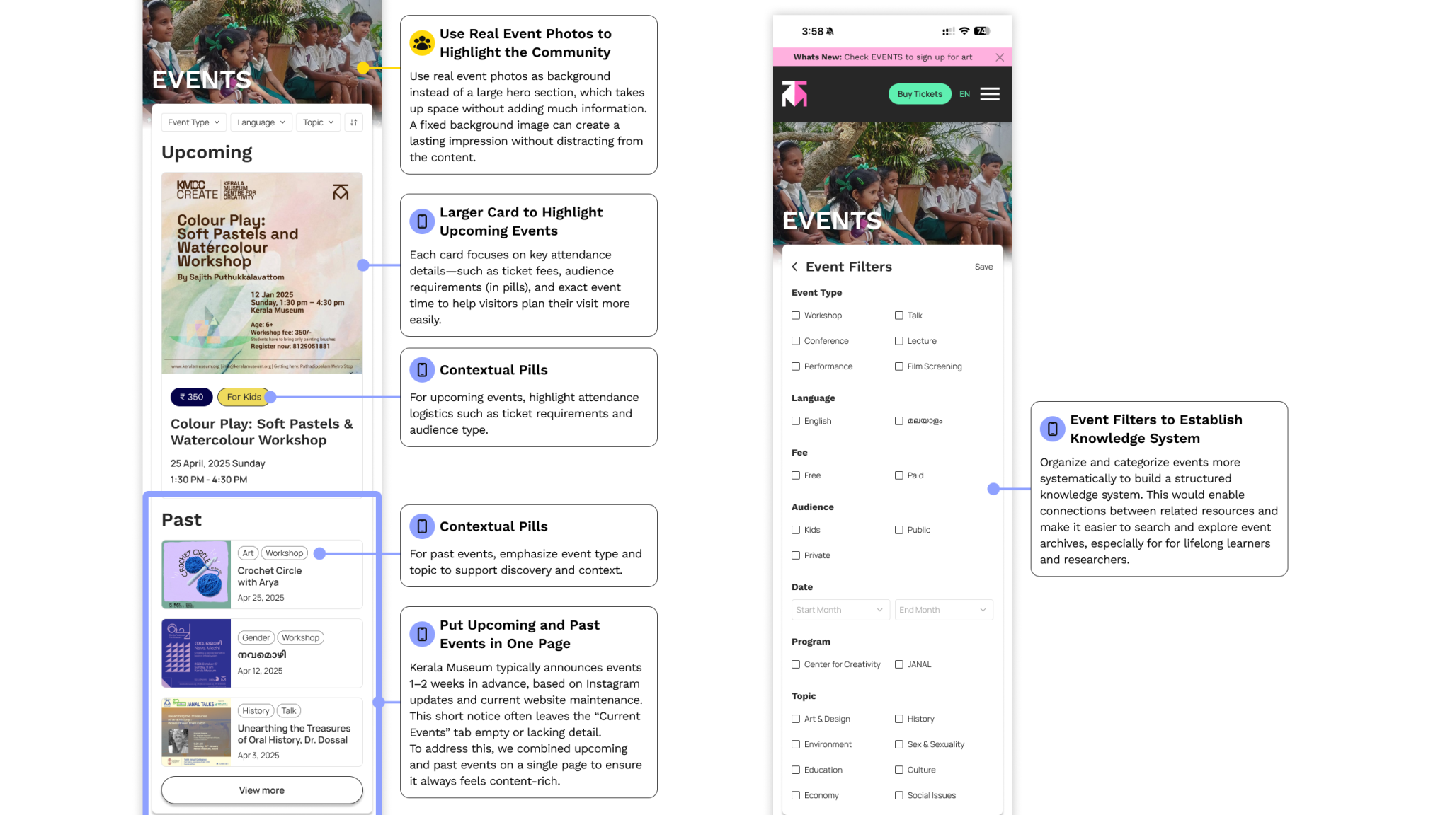 Event discovery with filters for type, date, and language; upcoming and past events separated clearly.
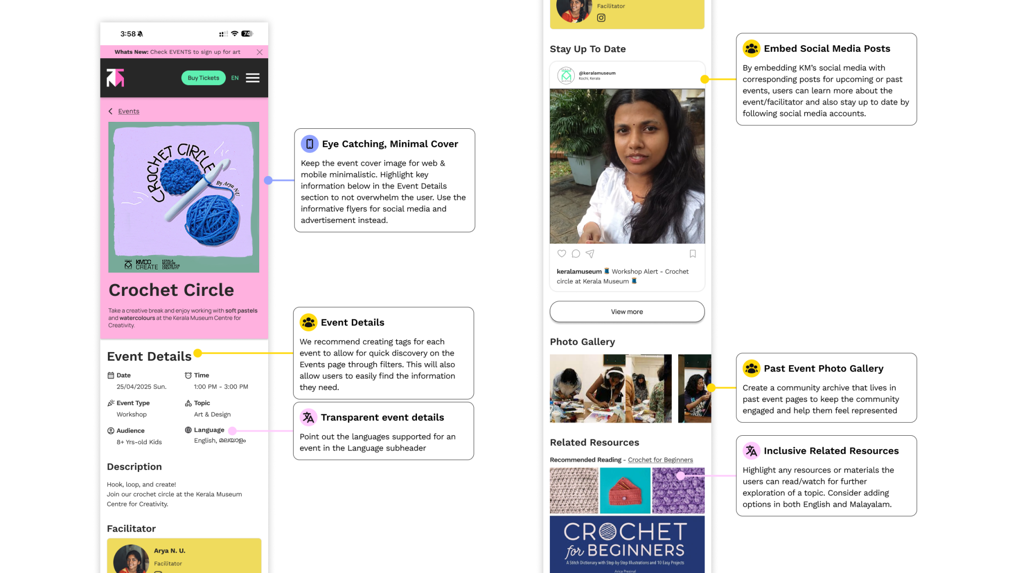 Past events archive that are browsable by year and type for community memory and documentation.
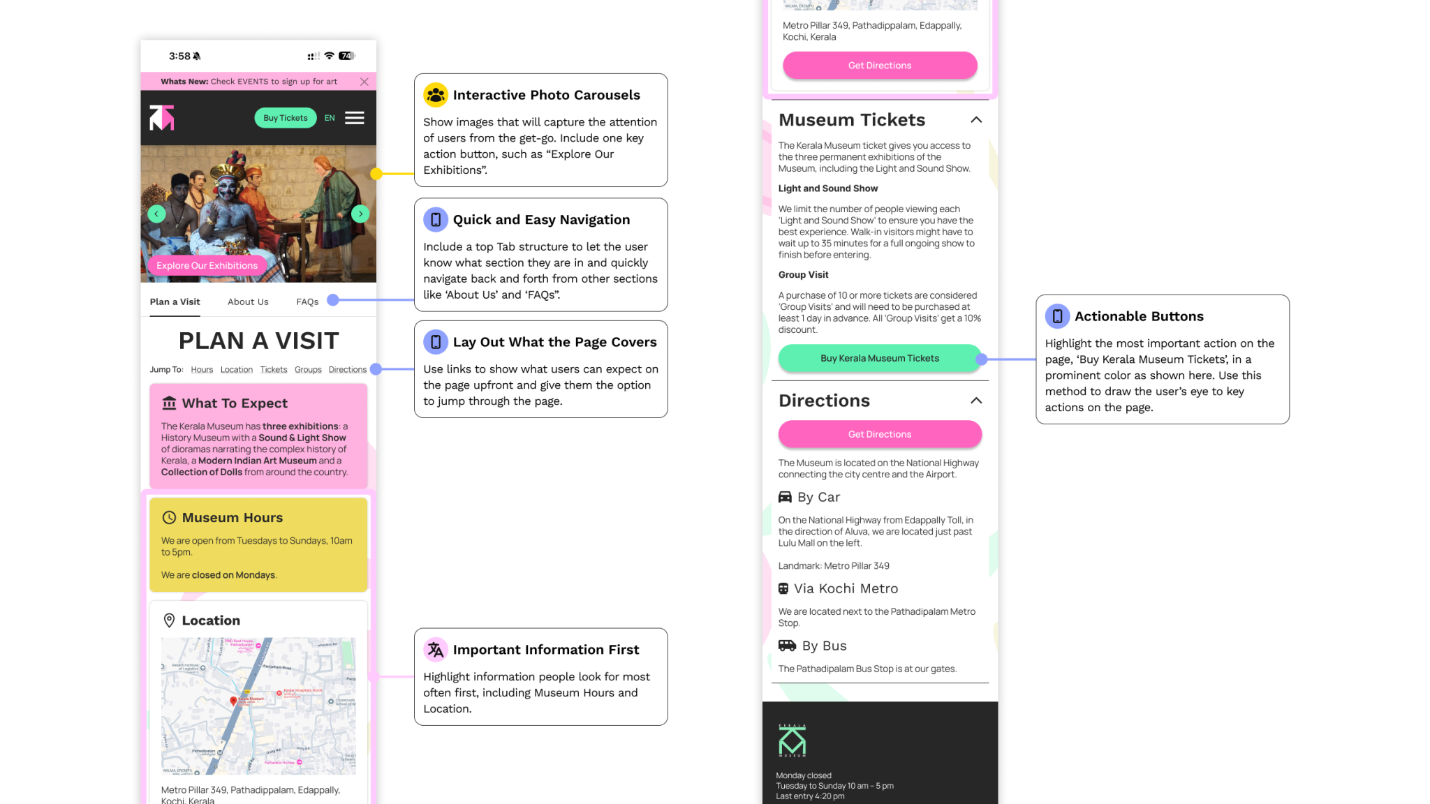
Ticketing
A streamlined checkout flow with clear pricing, accessibility options front and center, and no buried steps.
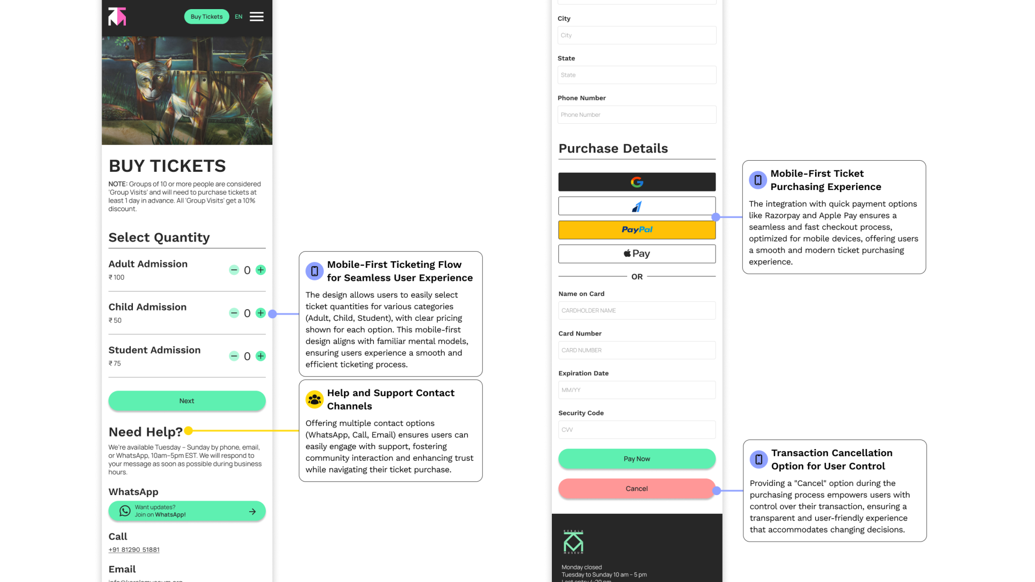 Buy tickets with pricing visible upfront, accessibility options integrated, and minimal steps to complete purchases.
Users noticed the difference immediately.
We ran usability testing on the final designs with participants drawn from our target audience groups. The feedback validated the core decisions and identified a few areas we refined before handoff.
Woah, this site is beautiful! I love the use of colors.
— Participant, usability testingBeyond aesthetics, users found navigation clearer, event discovery faster, and the ticket flow far less confusing than the original. We refined FAQ language, event filter labels, and mobile touch targets based on their input.
Built to grow
The redesign is designed as a flexible framework, not a static mockup. It supports:
- Dynamic event and exhibition updates: the CMS-ready structure makes it easy for staff to publish without technical help.
- Malayalam and English: multilingual support is added into the navigation menu for easy access.
- Social media integration: the platform can pull content from the museum's existing social media channels.
- Modular staff tools: administrators can manage content and events without developer involvement using WordPress ready templates.
What I learned
Remote UX = more research.
Without the ability to walk through the museum or observe visitors, every assumption had to be validated through interviews and testing. It made us more thorough in our interviews but it also made us aware of our biases and limitations.
Cultural context shapes interface decisions more than aesthetics.
The color choices, the copy, and the language support weren't just visual decisions. They were reflections of the museum's community.
Modular systems make complexity manageable.
The museum's content was inherently complex with events, archives, exhibitions, tickets, and multilingual support. Designing with modular components and a clear hierarchy meant the system could handle that complexity without overwhelming any individual page.