What Eye Tracking Revealed About the SVA Libraries Page

“I usually just ask someone at the front desk… the site is too much.”
-Usability Participant (SVA Student)
Project Overview
The SVA Libraries landing page was meant to help students help themselves (ex. find Resources, search the catalogs, book study rooms, etc.). Instead, most were skipping it entirely and turning to library staff.
Our team of UX Researchers from Pratt partnered with SVA to find out why.
We used eye tracking, retrospective think-aloud interviews, and the System Usability Scale to understand how students were really interacting with the site. This case study captures our process, findings, and recommendations for the SVA libraries landing page.
My Role
I co-led research, design, and data synthesis for this study. I conducted eye-tracking and RTA sessions, analyzed qualitative data, and designed recommendations along with my teammates.
Problem Statement
Why aren’t students using the SVA Libraries landing page the way it was designed to be used?
Methods
Mobile and desktop eye-tracking (Tobii)
Retrospective think-aloud interviews
System Usability Scale (SUS)
My Role
UX Researcher
Team
Rong Cheng
Gerard Samson
Timeline
September 2024 - May 2025
Context & Goals
About the Client
SVA Libraries, part of the School of Visual Arts, offers students access to research tools, study spaces, borrowing services, and more through a single scroll landing page.
The Challenge
Despite the page’s functionality, students weren’t using it effectively. SVA's Library staff noticed a gap, students were bypassing the site and turning to front desk staff to complete tasks the page was supposed to support (like reserving a study room). We were brought in to investigate why:
Target Audience: SVA Students
We focused on novice users, specifically students, who are unfamiliar with the SVA landing page and represent typical first-time visitors as our primary audience
Students
Location: New York City
Familiarity with page: Low
Goals
Identify usability issues on the SVA Libraries landing page.
Understand how students navigate the single-scroll layout.
Gather qualitative and quantitative data to inform design recommendations.
Recommend improvements grounded in user behavior and needs.
Methodology Overview
We conducted 12 eye-Tracking sessions on both mobile and desktop platforms to observe real-time user interactions.
Participants reflected on their usability tasks, providing insights into their decision-making processes through retrospective think-aloud interviews.
We collected quantitative data on user satisfaction and perceived usability with the System Usability Scale (SUS).
Our Impact
With all of our recommendations we were able to:
minimize the overall single scroll by nearly 50%.
Process
1
Recruitment
We created a screener survey to target current SVA students and staff member who use the library regularly.
Our screener ensured a mix of device usage (mobile and desktop).
2
Task Design
We developed realistic, goal-driven tasks based on common student needs, such as:
finding a book in the catalog, booking a study room, locating online resources, contacting a librarian, checking operating hours, and loaning equipment
These tasks were designed to reflect the real-world use cases the SVA team wanted to improve.
3
User Testing
We conducted a pilot test to refine our task wording, ensure our tech setup was stable, and verify that the tasks flowed naturally.
We conducted 6 mobile sessions & 6 desktop sessions using realistic scenarios. Each session included eye-tracking using Tobii to capture gaze behavior (plots and replays).
We ended each test with (RTA) interviews to explore participant reasoning, and (SUS) surveys to measure perceived usability.
4
Synthesis
By intersecting eye-tracking heatmaps, gaze plots/replays, think-aloud insights, and SUS scores, we were able to:
Identify where users struggled behaviorally
Understand why they felt frustrated or overwhelmed attitudinally
Quantify their experience with consistent metrics
To analyze the current website structure, we mapped the full landing page and its components. This helped us track user navigation paths during testing and spot content areas that caused confusion or were ignored.


Data Analysis
Quantitative + Qualitative Intersection
To make sense of all our findings we cross-referenced:
Eye-tracking heatmaps (attention and scan behavior)
Interview quotes and task success rates
A shared data sheet logging usability issues
SUS scores (cross-device satisfaction)
Scroll behavior through fixations and saccades
This intersection gave us both surface-level behaviors and deep attitudinal insights into user frustration.
SUS Score
The SUS survey gave us a numeric read on users’ confidence, frustration, and perceived usability. The System Usability Scale (SUS) added a valuable quantitative baseline to our qualitative insights.
We noticed two important patterns:
Mobile users scored consistently lower than desktop users as shown below
Low SUS scores aligned with moments of usability issues, such as:
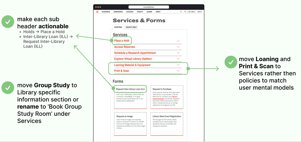
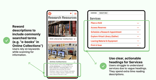
Clicking on non-interactive boxes
Getting stuck in semantic ambiguity ("Services" vs. "Resources")
Expressing visual fatigue from dense text
Our SUS responses said things like “I found the system unnecessarily complex” but “I felt very confident using the system”. This was an interesting insight, even when users completed tasks their scores showed they had trouble doing it. Overall the SVA Libraries landing page had all the necessary information users needed but fell short in making the user experience intuitive. We came up with 3 key findings from our data analysis.
Key Findings (Cross-Device)
100% felt overwhelmed by content and described the layout as an “endless scroll”
100% found the structure and information architecture did not match their expectations
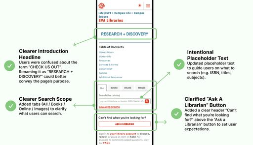
83% reported that unclear wording made it hard to understand the purpose of the page
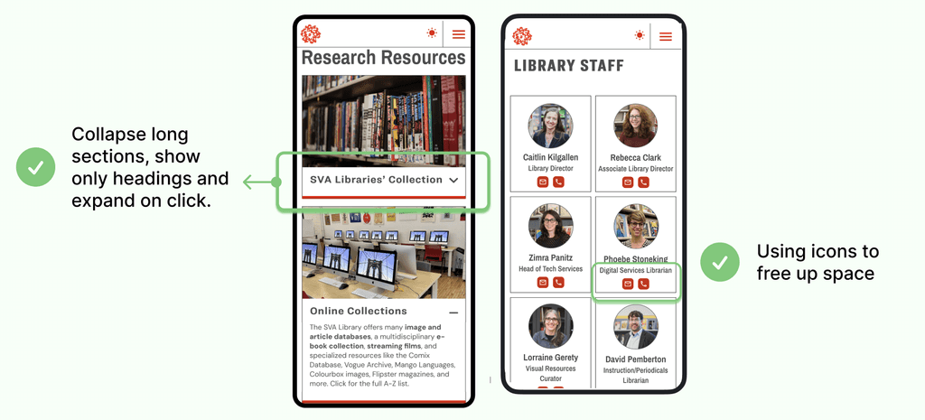
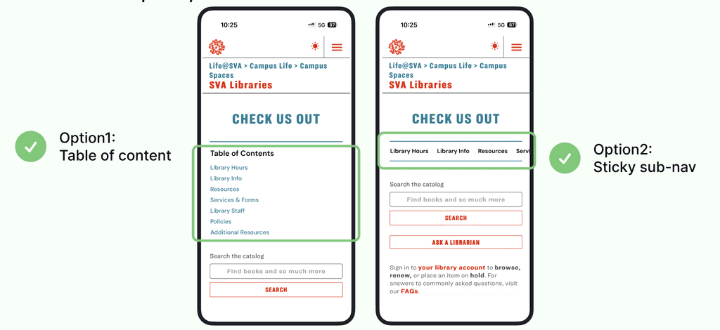

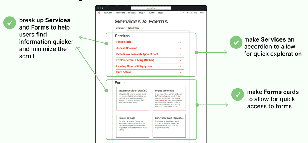
Final Design
With all of our recommendations we were able to minimize the overall single scroll by nearly 50%.
We presented our final findings and recommendations to the SVA Library team and got very positive feedback. They were thrilled to see their hypotheses validated and were curious to find out more about the SUS scores.
To see our final prototype and presentation use the links below!

Next Steps
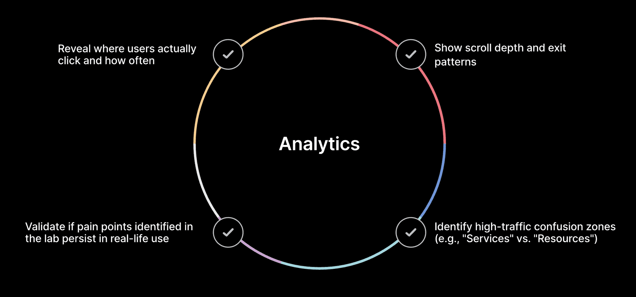
To validate our lab findings, I designed a follow-up behavioral analytics proposal using:
Google Analytics 4 for click paths, exit rates, time-on-page
Hotjar for more in depth heatmaps and session replays
To focus more on custom events like specific scroll depth or number of clicks on key CTA's like “Ask a Librarian,” “Reserve a Room,” etc. These analytics can help track real-world user behavior that is not being observed in a lab setting.